[Info][Review] ROM comparison for the Nexus 5

Golfdriver97

Trusted Member Team Leader
Moderator
Dec 4, 2012
35,365
110
63
Visit site
Stock vs. Paranoid vs. Liquid: A three way competition!!!

Ambassadors srkmagnus, B. Diddy, and myself have decided to collaborate a guide that will break down what Vanilla Android is like versus a couple custom ROMs. Since rarely do Ambassadors have the same device we thought it would be beneficial for the three of us to compare notes and share with our users.

B. Diddy will show Vanilla Android. srkmagnus will showcase Paranoid. And I will exhibit Liquidsmooth.


[NOTE]These are our own take on these ROMs. They obviously won't be for everyone. However, any method to get a peek at a ROM without flashing is always nice.[/NOTE]

[WARN]As always with custom ROMs, make a Nandroid before flashing. This will save hiccups from becoming headaches.[/WARN]
 
Last edited:

B. Diddy

Senior Ambassador
Moderator
Mar 9, 2012
165,533
4,668
113
Visit site
I'll review the stock Android 4.4.2 ROM on the Nexus 5, which was the first ROM to feature what is now called the Google Now Launcher (previously and informally known as the "Google Experience Launcher," or GEL). The Google Now Launcher is a significant departure from prior stock Android launchers in that it integrates Google Now as a homescreen, while abandoning the familiar standard of five homescreens with the Primary homescreen in the middle.

The homescreens below are shown in their actual relative position. The Primary homescreen (i.e., the one that will appear whenever you press the Home button) is the one with the clock widget (which, by the way, is DIGI Clock). Swiping to the left always brings up Google Now (which can also still be brought up at any time by pressing and holding the Home button, then swiping up). Swiping to the right will bring up any additional homescreens that you have set up. See the 4 dots above the App Drawer icon? That shows how many homescreens you have (including Google Now), and the larger dot signifies which homescreen you're on.
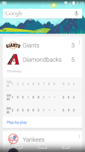
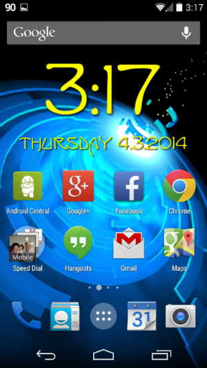
googlenow.png homescreen.png homescreenfolders.png

The homescreen above right shows you examples of folders. As you can see, you can place a maximum of 4 x 4 folders or icons on a single homescreen (not including the 4 you can place in the stationary Favorites Tray at the bottom). Folders are easily created by dragging one app shortcut on top of another (move it briskly, because if you move slowly, the other icon will just move out of the way). Tapping a folder will open it, as shown below left. There is also a limit of 16 shortcuts per folder.
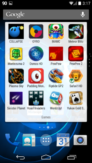
folder.png appdrawer.png newpage.png

Above middle is one page of the App Drawer. Again, notice the six dots above the Home button--this tells you that you have 6 pages of apps to flip through. (Notice also that there is no longer an option to list Widgets in the App Drawer--more on this later.)

Above right is a screenshot of adding a shortcut--this is to illustrate how to add additional homescreens. The homescreen that is shown is the rightmost one in my current setup. If you go to the App Drawer and start dragging an app, you will now have the option to create a new homescreen to the right, which is the only direction you can add (since Google Now occupies the homescreen to the left of Primary). While dragging the app, you will see a "+" appear to the right of those dots that represent your homescreens (yellow circle added by me for emphasis)--this means that if you drag the app to the right, you will create a new homescreen. Conversely, if you remove all shortcuts, widgets, or folders from a homescreen, that homescreen will disappear. So it is not possible to have a blank homescreen (apart from the Primary one).

[INFO]As far as I have tested, there does not seem to be a limit to the number of homescreens you can create. I stopped testing after creating 10.[/INFO]
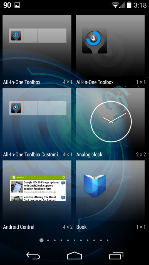
Below left is after long pressing on any empty part of a homescreen. This gives you an overview of your homescreens (which you can swipe through), as well as options for choosing a Wallpaper or Widget, and a Settings button. Tapping Widgets will bring up the familiar Widgets Drawer (below middle). Tapping Wallpaper will bring up the Wallpaper Picker (below right), which looks a little different from past interfaces. You can swipe through the wallpapers along the bottom to select.
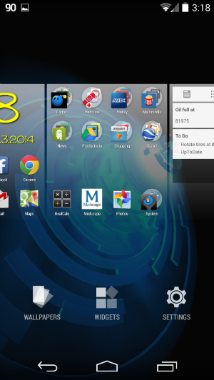
longpress.png widgets.png wallpaper.png

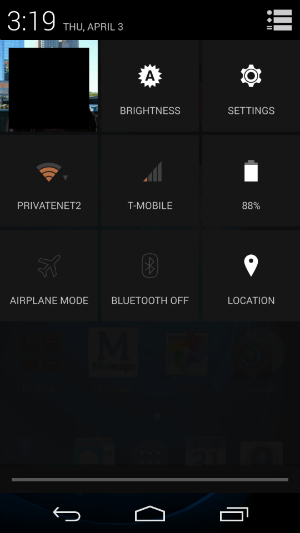
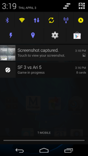
Below left is the Notification Shade, which is brought down by swiping from the top of the screen with one finger. (The toggles there are from Power Toggles.) Below middle is the Quick Settings, which is accessed by swiping from the top of the screen with two fingers. Tapping the icon at the top right toggles back and forth between the Notification Shade and Quick Settings.

Finally, below right is the Settings menu.
notifications.png quicksettings.png settings.png
 
Last edited:

Golfdriver97

Trusted Member Team Leader
Moderator
Dec 4, 2012
35,365
110
63
Visit site
7xhg4.jpg
Boot animation used with permission.

Liquidsmooth. This ROM is an AOSP based ROM that has a pretty good following. While not as popular as CyanogenMod, they do have a wide range of support for devices, and have a good record for updating the ROM itself.

I have been running Liquid as a near daily driver since 3-23-14. As of this writing (4-8-2014), I would have to say this is an extremely stable ROM. Among the best I have ever run. It wasn't until 3-28-14 that I ran into my first hiccup, involving wallpapers. I had a custom image that just would not stay set. Other than that, there have been no major problems.

[NOTE]Obviously, this is my own personal opinion, but something to go on is better than nothing.[/NOTE]

Without any further delay, I will jump right in.

Like I said, this is an AOSP ROM. So looking similar to B. Diddy's review of the stock ROM above, not much is going to change.
The basic app drawer, and settings menus will look the same, however there are some added sub menus.

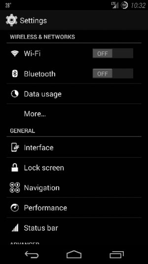
The bulk of where you will find differences in ROMs is usually in the Settings Menu.

Settings 1 (360x640).jpg Settings 2 (360x640).jpg

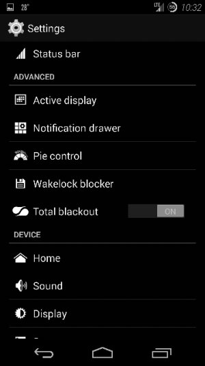
Above you can see the additional sections that you wouldn't normally see in a stock ROM. There are 2 sections added in between the Mobile networks and Device settings. I will break down the sections one by one further below. I will also describe any differences you see in my screens when the proper setting section arises, laid out with pros and cons.
 
Last edited:

Golfdriver97

Trusted Member Team Leader
Moderator
Dec 4, 2012
35,365
110
63
Visit site
Interface (360x640).jpg

Clock widget: Literally deals with the cLock app. If you don't use it, there is no need to go here.
Power Menu: This is the customizing of the power menu. Default is Off, Reboot, Airplane mode, and Sound. Color can be altered in the Style section.
Progress Bar: This is an interesting one. You can change the pattern and behavior of the progress bar. I do not recall seeing another ROM offering this.

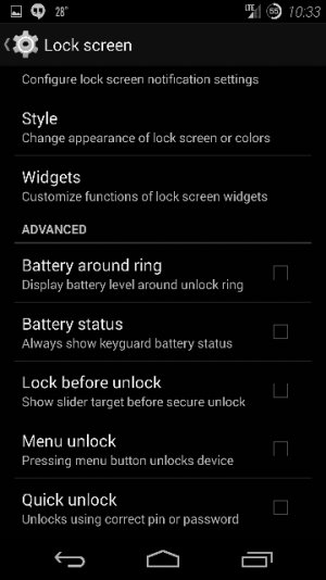
Lockscreen 1 (360x640).jpg Lockscreen 2 (360x640).jpg

Interface: You can change things like the lock screen wallpaper, and select slider targets.
Notifications: If enabled, you have a sliding pull tab for your notifications on the lock screen.
Style: Changes the look and feel of the lock screen itself.
Widgets: Enables and customizes the lock screen widgets and how they can look.

Navigation 1 (360x640).jpg

This is where changing the navbar buttons, order, and the icons for the buttons can be done.

Performance 1 (360x640).jpg Performance 2 (360x640).jpg

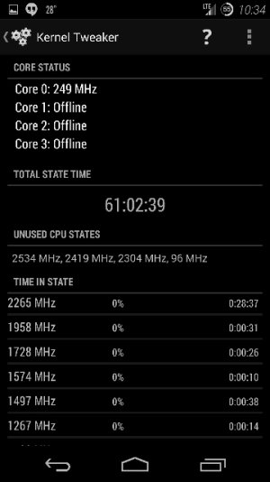
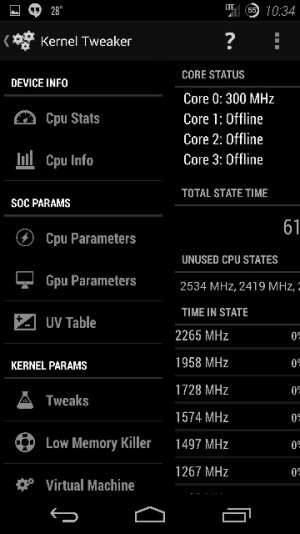
This is where the kernel can be changed. Under CPU Parameters, is where the CPU can be over or under clocked, and the CPU governor can be changed. This has several options, although the two most noteworthy are powersave and on demand.

[WARN]Some caution should be used when playing around with the kernel. Damage can be done by excessive overclocking the CPU.[/WARN]

Status Bar 1 (360x640).jpg

Battery Icon: This is where the battery icon can be altered. This is where I have changed the stock icon to the circle with the value in the center.
Clock and Date: This is where the clock position can be changed and the font for it. I really liked the italic, and left it.
 
Last edited:

Golfdriver97

Trusted Member Team Leader
Moderator
Dec 4, 2012
35,365
110
63
Visit site
Active Display 1 (360x640).jpg Active Display 2 (360x640).jpg

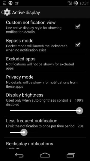
This is the section where it mimics the Active Notifications from the Moto X. Now, here is where LiquidSmooth takes it a step further. You can pick and choose which notifications to jump right to, unlike the Moto X version. This is a definite pro to this ROM.

Active Display 3 (360x640).jpg

This is where you can alter the refresh rate and other settings for the Active Notifications.

Notification Drawer 1 (360x640).jpg Notification Drawer 2 (360x640).jpg

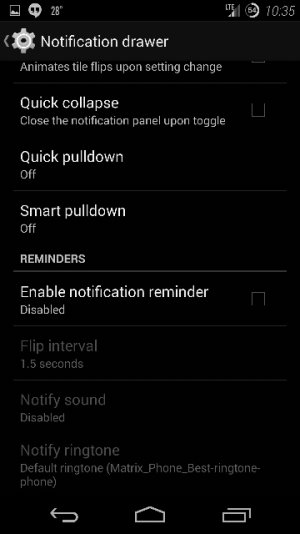
Here changes can be made to the Notification Drawer. Simple things like adding a wallpaper to the Notification shade can be done here.

Notification Drawer 3 (360x640).jpg

Further changes to the Notification Drawer.
Smart Pulldown: When there are no notifications in your drawer, it opens up the Quick Toggles Menu. This will not do anything if you have a persistent notification in the drawer, like a weather notification.
Quick Pulldown: This enables either the left or the right side of the Status Bar to go right into the Quick Toggles. For the Right edge, the area is roughly where the clock and battery bar is.

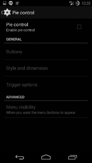
Pie Control (360x640).jpg

This is where Pie controls can be activated, and customized. This feature I have noticed to be quite buggy. The trigger is hit and miss and a case can greatly affect the ability to use it. I did not play with this feature much as I never really cared for it.

Total Blackout (360x640).jpg

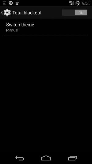
Total Blackout is a darkening of the ROM in several aspects. On stock applications, anywhere it is white is now black, and the settings screen is darkened. When this is off, the settings screen looks similar to the shading that is in B. Diddy's screenshots.

The List
The Pros and Cons with a few neutrals for flavor:

The Pros
- Active Notifications. These are similar to the Moto X and then some. If you have multiple notifications you can select which to answer first.
- Pull tab Notifications in the Lockscreen. Literally, a small tab roughly the size of a screen icon is on one side of the screen and you can pull it to see it.
- Working Torch and adjustable strobe light.
- Clear All in Recent Apps screen.
- Custom clock features with fonts.
- Option for Quick Ribbon in Notification Shade, similar to stock Samsung.
- Option for separated Notification and Ringtone volumes.
- Battery life better than Stock
- Custom Power down menu
- Custom LED notification and battery lights.
- Custom signal icon
- Total Blackout for core apps.
- Custom Navigation Bar

The Cons
- Trigger for Pie Controls buggy. Trigger working inconsistently
- Do Not Disturb buggy. Sometimes would block notification sound, sometimes not.
- ROM not optimized for ART. Can run apps as ART, but there is a disclaimer for doing so.
- Quick Toggles reversed from Stock, and do not seem to be reversible.
- The Wallpaper seems to not stick. It is very random. It will stick for 3 days to a week, before reverting to stock wallpaper.
(I will admit about the above; if there were a reversible option, this would not be such a big deal)

The Neutral
- Stock Calendar had a bug for exiting. Self fixed. After a day went back into it to test and worked properly.
- Dashclock: error in battery and weather reporting. Self fixed.
- Wake lock blocker. This one can be good and bad. Good for cutting back on apps that can force wake locks, bad if you don't know what you are doing.


Overall, I would recommend this ROM to anyone interested.
 
Last edited:

srkmagnus

Retired Moderator
May 23, 2010
13,434
210
0
Visit site
[INFO]This post is to take a brief look at Paranoid Android (PA) 4.2 Beta 5 - the latest public release of PA for the Nexus 5 installed on my device as of this writing. If you are looking for a ROM that is jammed packed with every feature known to man, PA is not for you. It's built from source and includes features developed by the PA Team, such as PIE Controls, and it's built to offer a . Right off the bat, don't pay attention to the Beta 5 build number as it has an official release build quality and is easily a daily driver for a lot of people, myself included. With that, let's get into the PA ROM for the Nexus 5.[/INFO]
Screenshot_2014-04-13-10-07-15.jpg

Home Screen/Lock Screen/App Drawer
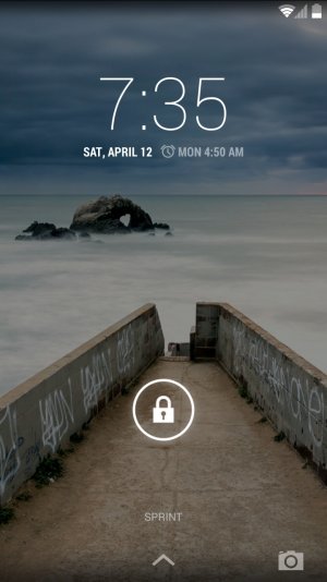
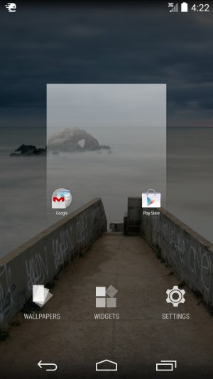
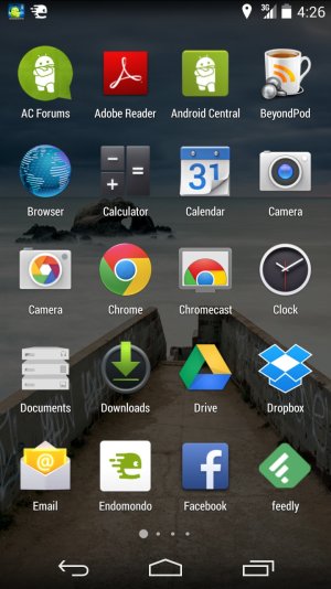
PA ships with two Launchers: Launcher3 and Google Now Launcher. For me, Google Now Launcher is currently in use for it's Google Now integration and the 'OK Google' hotword detection. Since I'm using the Google Now Launcher there won't be any difference in the way the Launcher functions when compared to stock - lock screen, home screen customizations and app drawer are the same as if using a stock Nexus 5.

Screenshot_2014-04-12-07-35-40.jpg Screenshot_2014-04-12-07-35-56.jpg
App drawer.jpg Screenshot_2014-04-21-16-22-35.jpg

Status Bar

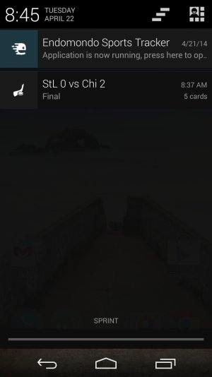
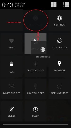
As with stock, the status bar provides both a notification view and tile (widget) view. The difference here is that the tiles with PA (as well as many other custom ROMs) are configurable. Tiles can be arranged by long pressing a tile and moving it to the desired location. Tiles act as a toggle to enable or disable the various settings and include a "switch" (two dots on each tile) that flips through various settings of that toggle. For example, tapping the data tile (Sprint in my case) will turn data off and on, but tapping the "dots" when data is on will switch to an LTE only network (if you are in an LTE covered area) or any data network (3g, 1x, etc.) if LTE is not available - pretty helpful if you know there's no LTE network within the area and the device can stay on 3g and not waste resources looking for a LTE signal.

Screenshot_2014-04-22-08-45-09.jpg Screenshot_2014-04-22-08-43-23.jpg

PIE

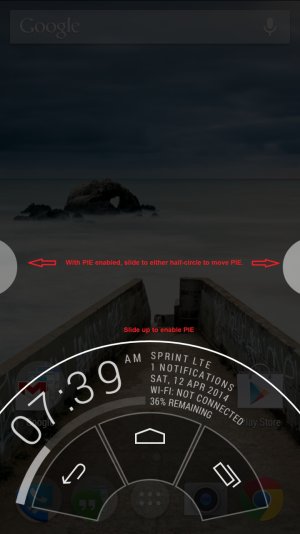
A great feature associated with PA is PIE. A home/back/recent alternative that is 1. moveable (can be activated by swiping into the screen from the bottom or sides) 2. provides a small notification center 3. is user friendly and 4. allows you to have more screen real-estate since the action buttons are hidden. (That's a quick list of why I think PIE is great) To enable PIE, you'll need to turn Immersive on by toggling the tile. When you get back to the home screen the action buttons will be hidden. Slide up from the bottom (start off screen and move onto the screen) to see the PIE controls. Actions are selected by sliding to that particular item - don't lift your finger as that will cause PIE to disappear. To see the notification center slide up past the action buttons and hold. You'll see a small notification center pop-up with battery information, WiFi state, number of notifications, etc.

Screenshot_2014-04-12-07-38-14 immersive.jpg Screenshot_2014-04-12-07-39-32_PIE.jpg

Peek

Peek is the PA Teams Active-Display like feature. It's built into the ROM and will display notifications with a small preview of what that notification is. The way it works is simple: When a notification is received (when the screen is off) the device is set in a small wake-lock which last for about 10-seconds and relies on the gyroscope and proximity sensors. The first impression with this type of feature is that it's a strain on battery life. I've been using Peek since it's introduction into a previous Beta build and have not noticed any significant battery drain than I normally did without it.

Screenshot_2014-04-28-16-11-57_peek.jpg

App Privacy

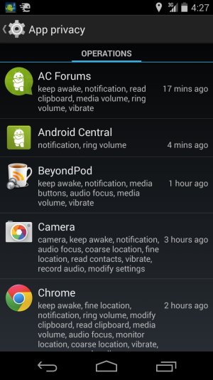
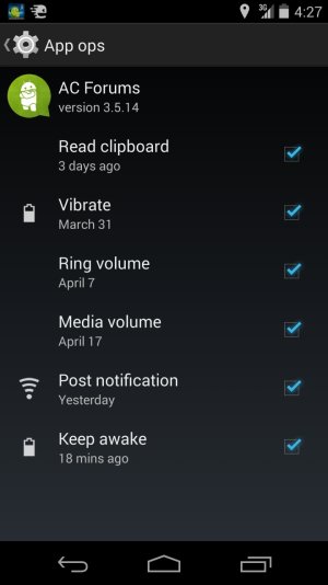
Another cool feature is the App Privacy setting under system settings. This allows you to see the apps installed and access App Ops by selecting a particular app.
Screenshot_2014-04-28-16-27-19.jpg Screenshot_2014-04-28-16-27-28.jpg

Final Thoughts

PA ROM for the Nexus 5 is well rounded and suitable for daily use. The PA Team releases weekly updates which include new features or enhancements to improve the over-all user experience. As mentioned above, it's not the most feature rich (yet, anyways), but does include the essentials to make the ROM worthy as a daily that will only get better as additional features are included. Also, the latest weekly release introduces a new feature, Hover, along with many other welcomed fixes and improvements.

For more information on Paranoid Android for the Nexus 5 (and other Nexus devices] take a look at the Paranoid Android Google+ Community Page.
 
Last edited:

Forum statistics

Threads
942,987
Messages
6,916,736
Members
3,158,762
Latest member
Dominic Haar