I hope they change the buttons on L?

Adiliyo

Well-known member
Oct 17, 2009
2,412
49
0
Visit site
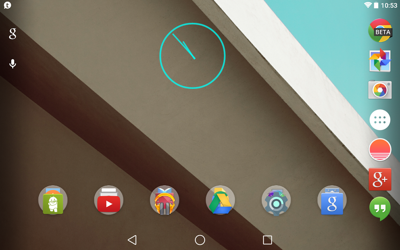
they're different, but they do somewhat make sense.

triangle pointed backwards = back
circle (there are a lot of circles in the new ui, coupled with the circular home button on ios) = home (plus, it's in the middle, honestly they could have made it a poo emoji and people would now inherently know what it was going to do)
square = recents (same shape as the recent app cards)
 

NoYankees44

Well-known member
Dec 20, 2011
1,258
22
0
Visit site
Put me in the "Hope they Change" crowd.

It looks like they are going for some sort of simplistic, not very well thought out, UI scheme with them. It looks like junior programmer's first attempt at UI or something. Almost like laziness.
 

npco543

Active member
Apr 22, 2012
27
0
0
Visit site
It looks like they are going for some sort of simplistic, not very well thought out, UI

Listening to/reading some of the interviews about the new Material Design, I wonder if it would be more accurate to say "simplistic, OVER thought out, UI".

The problem I see with the buttons is that when they loose any intuitive visual meaning - the circle and square look the same from any rotation/angle, and neither inherently mean "recent" or "home", the only thing giving them meaning is their order. Even the triangle is so symmetric that it's not immediately clear when it's orientation changes.

The problem is that we read left to right, top to bottom, so in portrait mode we read the buttons as Back, Home, Recent. In landscape mode, however, they're reversed - Recent, Home, Back. This is, of course, how they've always been, but when the meaning of the buttons was more self evident, it was easier to follow when the order changed.

All that said, I personally don't mind the new buttons, but I do think they're a step backward in UI design, which should always prioritize intuitiveness over design, and I definitely see it being confusing to new and/or older users.
 

Aquila

Retired Moderator
Feb 24, 2012
15,904
0
0
Visit site
Screenshot_2014-06-28-10-53-49.png


I'm not sure I care about the shape of the buttons as long as they're the same (or close enough to be obviously recognizable) and in the same order on all devices.
 

gregs1213

Well-known member
Dec 19, 2011
272
17
0
Visit site
I don't mind them, however they are not great for a first time user, especially the back button. I could see it being confusing to a first time user, they really don't serve a purpose.
 

ottscay

Well-known member
Jul 16, 2010
1,010
67
0
Visit site
I don't mind them, however they are not great for a first time user, especially the back button. I could see it being confusing to a first time user, they really don't serve a purpose.

That's my issue. I introduced my wife, daughter, mother, father, an aunt and several friends to Android, and I can say that 50-60% of them will be really confused by this chance, and any newcomers to Android will be even more lost. I've used the new buttons now on my N7 for a few days, and I agree that it's an easy switch if you're already used to the buttons (though I still don't think they look good), but they're too obtuse for the uninitiated, and anything that makes it harder to learn Android goes against the entire premise of the huge Material Design overhaul.
 

mrsmumbles

Well-known member
Oct 5, 2013
4,283
6
38
Visit site
I like the new buttons. It's hard for me to imagine that they would confuse anyone more than anything else about Android.
 

npco543

Active member
Apr 22, 2012
27
0
0
Visit site
I like the new buttons. It's hard for me to imagine that they would confuse anyone more than anything else about Android.

As I said, I don't mind them, but you just can't say that they won't confuse anyone. How does a circle represent returning to the home screen? It doesn't. How does a simple square represent recent apps. Again, it just doesn't. At all. The triangle at least is "pointing" backwards and so could be assumed to be a back button. On the other hand, due to it's equilateral design, and the simple nature of the accompanying buttons, it could be assumed to be a simple shape and mean virtually anything.

Again, I don't mind them, but it is a little concerning that it's getting to the point of design simply for the sake of design. When there's no particular purpose behind a design, then there's no reason to not redesign every version to follow recent trends or just on a whim. There's any number of areas where Android could use some attention, I just think the shape of the buttons wasn't particularly high on that list.
 

Flagz

Well-known member
May 25, 2013
104
0
0
Visit site
As I said, I don't mind them, but you just can't say that they won't confuse anyone. How does a circle represent returning to the home screen? It doesn't. How does a simple square represent recent apps. Again, it just doesn't. At all. The triangle at least is "pointing" backwards and so could be assumed to be a back button. On the other hand, due to it's equilateral design, and the simple nature of the accompanying buttons, it could be assumed to be a simple shape and mean virtually anything.

Again, I don't mind them, but it is a little concerning that it's getting to the point of design simply for the sake of design. When there's no particular purpose behind a design, then there's no reason to not redesign every version to follow recent trends or just on a whim. There's any number of areas where Android could use some attention, I just think the shape of the buttons wasn't particularly high on that list.

Soon-to-be Android user here, and I can see why his comment made sense. This will honestly be the LEAST confusing thing about android for a user to pick up. Honestly, once I saw the new interface I knew exactly what they were going for. For one they're simple looking, elegant actually. They also clean up the home screen and make it very modern with clean cut shapes. I approve, then again that could be because I'm coming from a Windows Phone.
 

ottscay

Well-known member
Jul 16, 2010
1,010
67
0
Visit site
Didn't realize there were so many people that can't remember 3 shapes and their functions.

It's not a concern about remembering (already using the new ones), it's about learning them when you're new to the platform. Remember that people like us who frequent AC forums are about the least important people to design Android around - the OS needs to be approachable to people new to smartphones or switching from other platforms, and the new buttons create a "WTF is that?" moment since they have no intuitive association with their functions.
 

mrsmumbles

Well-known member
Oct 5, 2013
4,283
6
38
Visit site
It's not a concern about remembering (already using the new ones), it's about learning them when you're new to the platform. Remember that people like us who frequent AC forums are about the least important people to design Android around - the OS needs to be approachable to people new to smartphones or switching from other platforms, and the new buttons create a "WTF is that?" moment since they have no intuitive association with their functions.

But I had those moments with the old buttons. I had a lot of those moments. :)
 

Golfdriver97

Trusted Member Team Leader
Moderator
Dec 4, 2012
35,367
113
63
Visit site
I think muscle memory will help people who are already used to onscreen buttons. They aren't any different from most Android devices, mainly the Nexus, some of the later Motos, etc, where the keys are all oriented the same.

As for the new crowd, as in anyone shifting from any other platform or a Samsung to a device with onscreen keys, this might be a little confusing, but people will easily get the hang of it.

I loaded L on my Nexus, and while at first I didn't like the look, now I don't even notice.
 

mrsmumbles

Well-known member
Oct 5, 2013
4,283
6
38
Visit site
I think muscle memory will help people who are already used to onscreen buttons. They aren't any different from most Android devices, mainly the Nexus, some of the later Motos, etc, where the keys are all oriented the same.

As for the new crowd, as in anyone shifting from any other platform or a Samsung to a device with onscreen keys, this might be a little confusing, but people will easily get the hang of it.

I loaded L on my Nexus, and while at first I didn't like the look, now I don't even notice.

I felt the same way, I wasn't crazy about how it looks (I don't have it on any device yet, just saw photos). But I'm wondering what everyone's thoughts are about Google incorporating Knox into "L"?
 

Golfdriver97

Trusted Member Team Leader
Moderator
Dec 4, 2012
35,367
113
63
Visit site
I felt the same way, I wasn't crazy about how it looks (I don't have it on any device yet, just saw photos). But I'm wondering what everyone's thoughts are about Google incorporating Knox into "L"?

As for me, I like the idea behind it, I just hope it doesn't act exactly like Knox to the effect of if a user wishes to unlock a device to flash a different ROM.
 

mrsmumbles

Well-known member
Oct 5, 2013
4,283
6
38
Visit site
As for me, I like the idea behind it, I just hope it doesn't act exactly like Knox to the effect of if a user wishes to unlock a device to flash a different ROM.

Yes, just what I was thinking about. I read they'll have an option to turn it off but I'm confused about the whole thing. I guess we will find out soon
 

Trending Posts

Forum statistics

Threads
943,133
Messages
6,917,444
Members
3,158,834
Latest member
Nikoczzzz