IMHO, you can blame Google for that due to their heavy push of Material Design which is about bright contrasting colors.
Material Design is about layout and interaction, not white cards. It literally makes the software seem three dimensional and provides a coherent interaction across design elements that should, by now, appear in most decent applications. Most Google apps use whites, but there's no expectation that all devs do so and dark theme design is 100% acceptable.
Material design tries to succeed making different elements feel logically interactive and somewhat tactile. So making edges that indicate how things appear in spacial relation, using light and movement in a way that makes the software feel more natural. Typography, space and color are important, but only as they direct a user in the ways that the app works. There is a point made in the guidelines about creating intentional white space, but the same can apply to intentional dark space. The intent is to make the functionality immediately obvious and give visual cues to the user for what they ought to do next. The biggest piece of material design coding is focused on motion. What things do when you touch them, how they move around and there's an emphasis on following the rules of physics, to a point. From a color standpoint, the focus is on having colors work well together and having consistency in the principles behind which types of colors are used in which .
This is the official video on the palette:
https://www.youtube.com/watch?v=xYkz0Ueg0L4
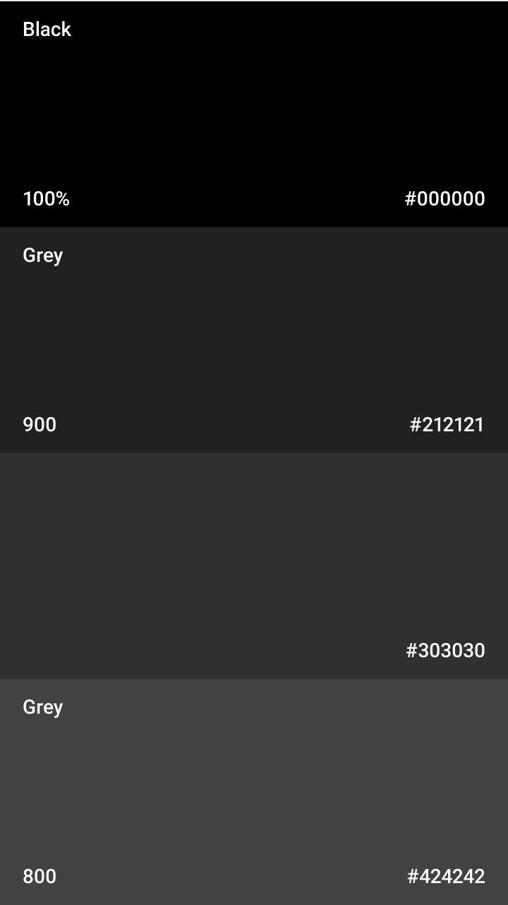
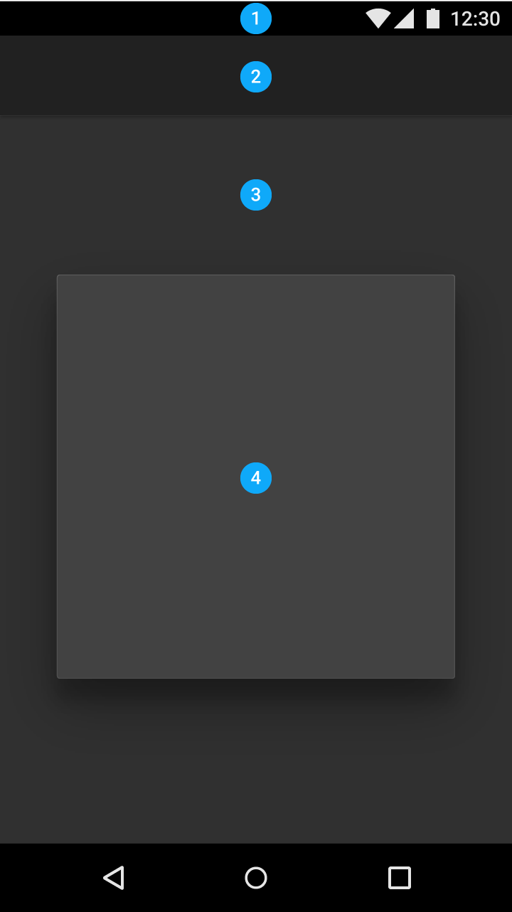
Within the style guidelines there are specifics about how to create a dark theme, including a super dark theme that looks like this:
Many apps do make use of dark themes, but many more haven't gotten the urge yet and emailing the developer to do so is a good thing to do. From a design standpoint, it's not that difficult to implement a dark mode, they just have to be aware of how their buttons, toggles, etc. will appear and make adjustments to the color selections.

 Hi
Hi