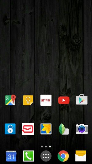
New Themes (including a dark theme)
- Thread starter smooth4lyfe
- Start date
You are using an out of date browser. It may not display this or other websites correctly.
You should upgrade or use an alternative browser.
You should upgrade or use an alternative browser.
I Can Be Your Hero
Well-known member
Not a fan of any of them.
I'd like a darker type of theme, but the ones they release....ugh.
Just let us customise a theme ourselves....
I'd like a darker type of theme, but the ones they release....ugh.
Just let us customise a theme ourselves....
TimmE
Well-known member
This will he my last time posting something like this, but wanted to make everyone aware
View attachment 177429
View attachment 177430
View attachment 177432
View attachment 177434
Sent from my Samsung Galaxy S6!
Thanks for the heads up.
Posted via the Android Central App
I like the "Waiting for the Train" theme. really changes the settings too
This one is a keeper for now
"Dlto" is a good developer
This one is a keeper for now
"Dlto" is a good developer
BioFanatic
Well-known member
jcp007
Trusted Member
I like the "Waiting for the Train" theme. really changes the settings too
This one is a keeper for now
"Dlto" is a good developer
I assume there's an option to change the language? Keep posting.
chezm
Trusted Member
Erm10
Well-known member
Again...colorless icons?? Ugh this is annoying.
Posted via the Android Central App
Was just going to say the same thing! Waiting for a dark themed with colored icons. Without color I think it would take significantly longer to pick out the app you want - especially on screen 3 or 4 that you visit less frequently.
Techno-guy
Well-known member
This will he my last time posting something like this, but wanted to make everyone aware
No! Keep letting us know about the new Themes smooth4lyfe...we really appreciate your posts!
Still no professional, business theme...ugghhh!!!
ron561
Well-known member
I think Samsung pulled a fast one with this theme store....even the developers who are releasing themes, like cogul(who already had the cogul black theme ready) just aren't going to release a simple theme.
I assume there's an option to change the language? Keep posting.
It will be in English autoatically if the phone's language setting is English
tlo07
Well-known member
droidguy1964
Banned
getbretweir
Banned
f308gt4
Well-known member
So close, yet so far. The railroad one looks great, but I don't like the cityscape background on the dialer, calendar, etc. If they just made that a plain white or gray background, it would be perfect.
deeb215
Well-known member
monkmullen
Well-known member
The dark theme looks good with a black wallpaper
Sent from my Samsung Galaxy S6!
So close, but not quite. Everything looks fine until we get to the settings menu (and I'm guessing maybe the dialer, and maybe contacts) and there's that skyline. Ugh.
There have been a couple themes that have been ruined for me because of little touches like that. Little doodles or graphics here and there. They just need to practice a little more restraint on some of these themes.
Wiggum333
Well-known member
See ... THIS is the problem with most ALL of the themes ... even the better ones:

These "designers" can't seem to keep themselves from using these unnecessary backgrounds on menu screens that should never, ever, EVER have ANY type of background other than a plain jane color or a gradient fade from top to bottom of a harmonious color. Background pictures just clutter everything up.

These "designers" can't seem to keep themselves from using these unnecessary backgrounds on menu screens that should never, ever, EVER have ANY type of background other than a plain jane color or a gradient fade from top to bottom of a harmonious color. Background pictures just clutter everything up.
What brightness widget is that?
Its called "Widgetoids"...you can make widgets out of almost anything with it
So close, but not quite. Everything looks fine until we get to the settings menu (and I'm guessing maybe the dialer, and maybe contacts) and there's that skyline. Ugh.
There have been a couple themes that have been ruined for me because of little touches like that. Little doodles or graphics here and there. They just need to practice a little more restraint on some of these themes.
Ehh, I guess its an acquired taste. I think it adds a nice touch, but I wish it was blurred instead of clearly visible like that because it interferes with the text
Similar threads
- Replies
- 7
- Views
- 2K
- Replies
- 0
- Views
- 377
- Replies
- 11
- Views
- 3K
- Replies
- 0
- Views
- 123
Trending Posts
-
[Chatter] "Where everybody knows your name ..."
- Started by zero neck
- Replies: 53K
-
-
Why does my sunrise alarm still come on even though I've turned the setting off?
- Started by swsmpbaby985
- Replies: 12
-
-
S24 pictures... show us how they look!
- Started by Walter Wagenleithner
- Replies: 379
Forum statistics

Android Central is part of Future plc, an international media group and leading digital publisher. Visit our corporate site.
© Future Publishing Limited Quay House, The Ambury, Bath BA1 1UA. All rights reserved. England and Wales company registration number 2008885.


