- Feb 8, 2014
- 2
- 0
- 0
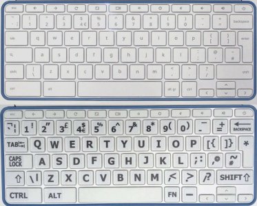
This image compares the keyboard of the HP Chromebook 11 G1 with the same keyboard after I applied large-letter keyboard stickers. As you can see, the original light-gray-on-white keyboard lettering looks much cooler and more modern. However, after I applied the stickers, I found I could type faster in normal light and much faster in dim light.
I think people who don't touch-type use peripheral vision to locate the next one or two letters. On the original keyboard, I could see the letter I was looking for, but my peripheral vision couldn't detect the next keys. The big high-contrast letters made a big difference. And their being upper-case helped also: look at the i (I), the j (J) and the l (L) on the original keyboard.
I'm curious to know what other Chrome OS users think. Should the lettering on keys be larger? Should it be high-contrast? Should the letters be upper-case? Or should they continue to be cool and modern?

Last edited:

