The new header layout is a regression
- Thread starter Relgoshan
- Start date
You are using an out of date browser. It may not display this or other websites correctly.
You should upgrade or use an alternative browser.
You should upgrade or use an alternative browser.
View attachment 122775
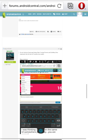
This is not 2004, reflow and responsive CSS are the most basic components of good site design. There is no reason that touch input users need to be punished like this. The desktop version of the forums always worked great on Android before now.
I'm sure they'll work things out. Responsive CSS can be somewhat complicated at times, but nothing like a little trial and error can't do. If you have problems, there is always the Android Central apps:
https://forums.androidcentral.com/e...ails?id=com.androidcentral.app&token=nWjV4i8J
https://forums.androidcentral.com/e...om.quoord.tapatalkacf.activity&token=K1_S28uU
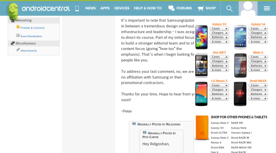
Well, looks like private messaging is also broken at this width. It is very impotant to test thoroughly at 720p on multiple devices because 1080p and higher is still not the default. Most laptops, many phones and even the newly reviewed 8" Tab 4 still are 720p class. It desperately needs to be reverted or fixed.
View attachment 122789
Well, looks like private messaging is also broken at this width. It is very impotant to test thoroughly at 720p on multiple devices because 1080p and higher is still not the default. Most laptops, many phones and even the newly reviewed 8" Tab 4 still are 720p class. It desperately needs to be reverted or fixed.
You also need to take into account that the header is one of many things to come. A new website redesign was stated I think. Right now, the header is responsive but the website itself is not. There is a light version of AC for mobile devices as well.
Oh I figured this was only part of a larger update, I just made a thread as soon as I realized how broken it currently is. The mobile interface is too simple, intended more for very small screens. And there is a problem with login cookies when switching Opera to offroad mode, where normally on other sites I am still logged in. I should check that last one, it may turn out to be an Opera regression instead...
I try to always use desktop version of sites. 95% of the time they work, there are more options for viewing/posting/editing and I don't have all these apps clogging my drawer. Also the posting apps including Tapatalk tend to butcher image attachments and cause other issues. And identifying as mobile is bad because a lot of sites have drive-by-downloads targetting Android now.
...and for my inner snob, people are far more impressed when they see a mobile device doing everything a full sized PC can... /honesty/
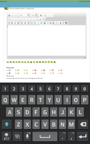
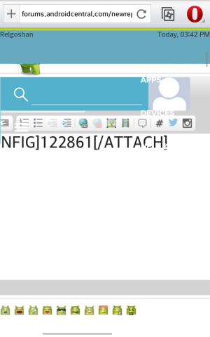
Many thanks, I didn't know that logging back in was so badly affected. As shown in my screenshot I have lost half of my composition area in landscape view. Opera doesn't seem to have any missing elements and probably neither does Chrome or Firefox, but yeah stock Android browser just tips over trying to render the page correctly.
Nav headers are a bad 90s idea and worse when you cannot banish them. At least make it bing-like so it's always a half-inch scroll away? But not ever present.
I just loaded the site on my laptop and...eck. The dingy green article showcase makes me feel like I am drowning. It's a nasty feel like someone Ctrl-A'd and now I cannot get rid of the element highlighting. At first I thought the layout was broken even at 1680x1050, then I realized I can drag-scroll that mess. No auto scroll or onHover arrows, just a cut off "LG G3 Rev" on the right hinting that more content lurks out of sight. Kill it with fire, it's buggy slow and gross even on a PC.
"androidcentral.com is not responding due to a long running script"...? IT IS THE ONLY TAB IN THE ONLY PROGRAM OPEN. And the claim it works on all devices and resolutions is a patent lie which shows how little it was tested. It's insulting for an Android site to be broken in the Android browser, like a iPhone fan site that doesn't work in Safari.
Not even kidding, if it gets any worse than what they've already done I will completely leave the domain. No articles, forums, nothing. The ads are less offensive, at least their layout is not broken.
I completely agree about the new header! This feels like it wasn't properly tested or is an attempt to get me to use their app (which I don't want). See my comments below from the blog article;
Allow ourselves to introduce ... ourselves | Android Central
I like most of the changes except the following (using Firefox on my laptop):
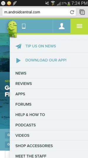
1. The header is always there taking up space (even in the forums, ugh!). It should disappear until I need it; such as by mousing over the area to get it to re-appear. Edit: this is even worse on my Note 2 where I prefer to use the full site (never cared for the mobile site). This is completely unacceptable and makes me not want to visit here using a mobile device!
2. It now takes two clicks to get to the login screen. Previously it was just one.
3. Too much blue and an odd shade of it. Feel like I'm swimming in water.
4. Featured stories area at the top is too big and the blue tint makes it look washed out
On that note: I'm looking forward to the traditional blog view option for the homepage.
Update, more feedback; On my Note 2 using the stock browser I can't log into the forums using the full site. I have to either come to the blog side or attempt to respond to a post to get the login screen. Otherwise the login option on the new header is off the screen in landscape or portrait. Actually the entire header doesn't display properly. It has little blue squares all along it.Also in replying here in landscape the comment box disappears under the header. Have to use portrait to even see it.Finally the site, forum or blog, feels heavier and takes longer to load even on fast Verizon LTE. All around this update is nothing but a PITA to me.
Another update; while browsing the forums (again stock browser on the Note 2) in full site mode, the new header will drop some of its elements (ex. my avatar, search option, hamburger menu) down into the page itself below the header. I have to refresh the page to get it to clear. But it will happen again when changing between landscape and portrait or vice versa. Argh, please make it stop!! I hate that new header now with a passion. It's completely ruining my use and enjoyment of this site!
- Mar 9, 2012
- 169,741
- 11,158
- 113
And the claim it works on all devices and resolutions is a patent lie which shows how little it was tested.
You're giving good feedback, but otherwise please try to remain constructive--thanks.
- Nov 25, 2010
- 15,958
- 2,753
- 0
I'll repeat what Ambassador B. Diddy stated. This was just the first step in what will be many to come to make things better in the long run. Constructive criticism is welcome but there is no need to rant or bash the work that I'm sure many team members on the design team spent untold hours constructing.
Like anything you can test things on a test server or offline to a limited group but you don't know the full effect until its put LIVE with all banners, ads and other key components in place to see how things really flow.
Best you can do is as you have already done and provide screenshots with detailed info on what device, browser, etc. your viewing the forum & blog in so the tech teams can make the tweaks necessary to iron out the bugs.
Thanks!
I could have worded that line better, yes. My mistake. It's frustrating to show up at a familiar site and find it crippled...I'm keeping my nose out of the blog post, that comment section is getting pretty bad.
I will try to dredge up some more of my devices with similar rez but different DPI settings, check into that and explore the new collapsing menus further. It would be best if most of the effort already expended can be saved.
The odd color will be a persistent issue if they keep it, it's in a bad part of town. On some screens the top is green, others aqua and others blue. That's just among the stuff plugged in and running right now. Also the problems for people who have certain forms of colorblindness. It probably looked fantastic on the designer's screen but a friend of mine in art school had similar issues with pastel colors on her mac being nearly invisible on most Windows computers.
I could have worded that line better, yes. My mistake. It's frustrating to show up at a familiar site and find it crippled...I'm keeping my nose out of the blog post, that comment section is getting pretty bad.
I will try to dredge up some more of my devices with similar rez but different DPI settings, check into that and explore the new collapsing menus further. It would be best if most of the effort already expended can be saved.
The odd color will be a persistent issue if they keep it, it's in a bad part of town. On some screens the top is green, others aqua and others blue. That's just among the stuff plugged in and running right now. Also the problems for people who have certain forms of colorblindness. It probably looked fantastic on the designer's screen but a friend of mine in art school had similar issues with pastel colors on her mac being nearly invisible on most Windows computers.
Just asked my dad who is color blind (I believe he has Deuteranomaly). He said it looks fine and can distinguish everything okay.
The website (mobile and desktop version) is EXTREMELY (100% unusable) laggy on my Nexus 7 (2013). I know that it is NOT the Nexus 7 that is causing the lag, because it runs smooth on every other website, except Android Central. Please fix this.
TOTtomdora
Well-known member
- May 5, 2014
- 76
- 0
- 0
The website (mobile and desktop version) is EXTREMELY (100% unusable) laggy on my Nexus 7 (2013). I know that it is NOT the Nexus 7 that is causing the lag, because it runs smooth on every other website, except Android Central. Please fix this.
I'm going to have to dispute this (not saying I don't believe you).
On my nexus 7, the site takes a couple seconds to load up, which causes framerate problems, but once it's loaded up, everything's all smooth on chrome.
SENT FROM MY NEXUS 7 USING TAPATALK.
Hmm... It is only laggy on my Nexus 7 2013 (maybe just because it is on the desktop site instead of the mobile site.) On my Galaxy S3 it works perfectly fine (using the mobile site).I'm going to have to dispute this (not saying I don't believe you).
On my nexus 7, the site takes a couple seconds to load up, which causes framerate problems, but once it's loaded up, everything's all smooth on chrome.
SENT FROM MY NEXUS 7 USING TAPATALK.
David Lundblad
Director of Design
- Dec 6, 2010
- 36
- 47
- 0
Thank you all for highlighting these issues. Yesterday and last night was spent bug fixing and tweaking so we really appreciate your patience.
Many of the issues mentioned here are now fixed. The work continues.
The struggle to launch it perfectly comes from us deciding to mix the old site with parts of what will be the new site. Long story short, we are mixing Responsive design with non-responsive and sometimes it causes a hickup.
Many of the issues mentioned here are now fixed. The work continues.
The struggle to launch it perfectly comes from us deciding to mix the old site with parts of what will be the new site. Long story short, we are mixing Responsive design with non-responsive and sometimes it causes a hickup.
Trending Posts
-
Android 17 QPR1 Beta 1
- Started by wyelkins
- Replies: 7
-
-
Question Phone not autofilling password/passkey for only one app
- Started by Scooch
- Replies: 2
-
-
Members online
Total: 9,358 (members: 7, guests: 9,351)
Forum statistics

Space.com is part of Future plc, an international media group and leading digital publisher. Visit our corporate site.
© Future Publishing Limited Quay House, The Ambury, Bath BA1 1UA. All rights reserved. England and Wales company registration number 2008885.

