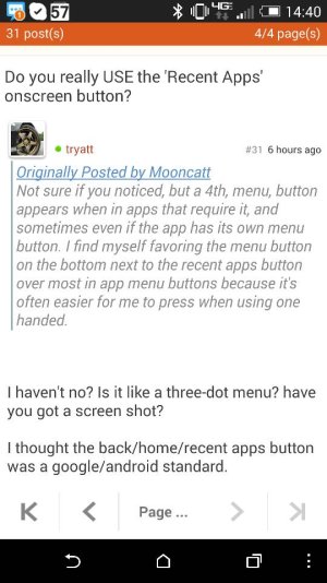
Do you really USE the 'Recent Apps' onscreen button?

Anyone else wish the recent app screen held more apps, even if it meant scrolling? There's been several times where I haven't used something in a while, but want to go back to it and it's been removed to fit in something else. Mind you, the app isn't killed in memory, just removed from that list. I've also noticed a few times where I opened an app for something, left it, and it won't be added to the recent apps screen at all unless I go into the app again.
 
It's very useful to me. Just to multi-task, move around. And for the occasional need to close an app.

Posted via Android Central App
 
Use it all the time

Sent from my HTCONE using AC Forums mobile app
 
Use mine constantly on my tablet & phone. Makes it super easy to hop between texting, email, forums, Amazon shopping, music apps, gallery, games, camera, Twitter, Google plus..... I am 2 taps away from any app I have already opened.

Posted via a beautiful Ebony backed Moto X or the amazing Nexus 10 using the totally awesome Android Central App
 
I use it all the time. However, I can see your point that it would be helpful to allow the user to select what task to do.
 
On the One X I wrote to HTC about how pointless I found the 'recent apps' button, but it was more in line with other google devices. Although later they added an update that allowed you to choose how the 'recent apps' button behaved.

You could set it so that it was a menu context button, but on a long press it would bring up recent apps. Best of both worlds. Its a shame to have lost that feature.

Ironically I use the recent apps button more than I thought I would.
 
You could set it so that it was a menu context button, but on a long press it would bring up recent apps. Best of both worlds. Its a shame to have lost that feature.

Not sure if you noticed, but a 4th, menu, button appears when in apps that require it, and sometimes even if the app has its own menu button. I find myself favoring the menu button on the bottom next to the recent apps button over most in app menu buttons because it's often easier for me to press when using one handed.
 
Not sure if you noticed, but a 4th, menu, button appears when in apps that require it, and sometimes even if the app has its own menu button. I find myself favoring the menu button on the bottom next to the recent apps button over most in app menu buttons because it's often easier for me to press when using one handed.

I haven't no? Is it like a three-dot menu? have you got a screen shot?

I thought the back/home/recent apps button was a google/android standard.
 
Here ya go, in the very bottom right. This is from the AC Forums app, but it also shows in addition to some app's built in menu button like Handcent. It seems to be somewhat hit and miss when it shows, depending on the app in use.
 

Attachments

  • 1405107676603.jpg
    1405107676603.jpg
    68.4 KB · Views: 10

Forum statistics

Threads
957,957
Messages
6,975,085
Members
3,163,948
Latest member
fulapmu2