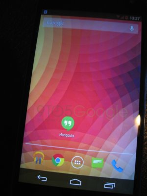
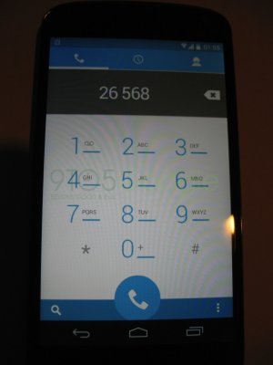
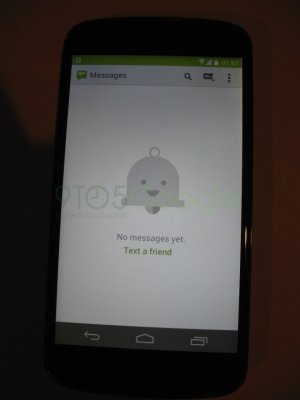
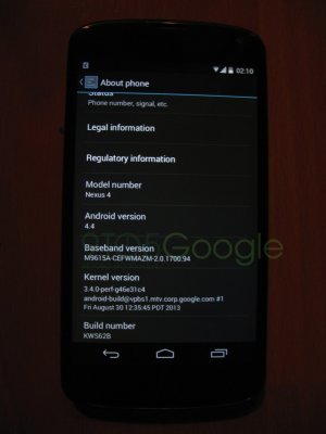
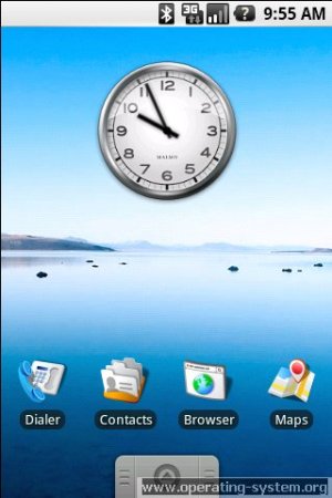
KitKat Leaked Images

It looks pretty slick to me. And it's impossible to say they're following iOS since Windows Phone had it first. :P
 
http://www.operating-system.org/betriebssystem/bsgfx/android/android-sdk1-scr-03.jpg
It looks pretty slick to me. And it's impossible to say they're following iOS since Windows Phone had it first. :P

I'm not quite sure what makes it "slick" but it does look a lot like the old ICS dialer. Windows doesn't have enough market share to influence any trends, probably more of a coincidence with Windows then anything.


If you think KitKat is slick you'll love the rumored Android 5.0 leaked pic:

android-sdk1-scr-03.jpg
 
http://www.operating-system.org/betriebssystem/bsgfx/android/android-sdk1-scr-03.jpg

I'm not quite sure what makes it "slick" but it does look a lot like the old ICS dialer. Windows doesn't have enough market share to influence any trends, probably more of a coincidence with Windows then anything.


It's not a coincidence, it's a new trend in design philosophy. Apple has consciously moved away from their old skeuomorphic model towards the cleaner lines of "flat" design that Android and Windows have had for a few years now.

Sent from my Nexus 4 using AC Forums mobile app
 
Really? iOS is boring? How so? I think it's just fine. What do you want either of these OS's to do that they don't already do? With any Android OS everyone is going to root their devices and run some custom ROM of some sort so who cares? Kit kat looks nice. Just like ICS, just like JB. Just a new model year, that's all.

With iOS everything is designed for the user who wants something bullet proof. Smooth operation, simple to understand and ease of use. They wrote the book. Every other OS is just a different iteration. Like GM v. Ford, they both do the same things, but just a little differently.

Maybe I"m an anomolly but I use iOS as well and like it just as much. I just don't obsess over these things.

Sent from my Galaxy Nexus
 
The flat everything is kind of disappointing and the bright colors are reminding me of my ios7 reaction. I sure hope they have a dark option. Especially for the notification bar.

I hope for a whole list of new features as well:-)
 
Really? iOS is boring? How so? I think it's just fine. What do you want either of these OS's to do that they don't already do?

Seems like you've been waiting to get that rant out big time! :) Unfortunately we're talking about design aesthetics not functionality, at least I was.

But long as you brought it up WebOS had the best UI navigation ever and I doubt any company could come close because it's been many years and they haven't. The Card system was elegant, satisfying and easy.
 
Hmm that's quite interesting actually. I may be wrong but it looks like they picked up at least one feature from pa. If you look at the status bars, they seem to change color depending on the app, for instance in settings its black (standard) and in MMS its green.

Maybe that will give those "this roboto black theme has to go" people something to be excited about.

Also the status icons appear different colors in some of the photographs. Could Google have perhaps included theme chooser in the stock repo? That would be amazing.

If those are the real deal, its looking pretty good. I don't see where they are copying iOS. And it looks nothing like windows phone. It actually looks pretty much the same to me, besides a few ui and icon updates to modernize it.

Sent from my SPH-L710 using Tapatalk 2
 
I'm disapointed with the white dialer. i love the darker themes we currently have and I do hope there will be options for color themes this time around. i have been a huge fan of the dark and holo blue. I guess if android has trained me for anything its to accept change, though. Still hope to see an option for the dark themes.
 
And as Android Police pointed out these images are fake and not official KK

Sent from Bad Azz VZW LG G2 Cyan Tapatalk
 
I hope they are fake because it doesn't look like they did anything to move the Android OS forward aesthetically.
 
My two bets are 1. That's PA 2. 4.4 looks mostly like 4.3

XT1060. Through spacetime.
 
I'm not betting on any major UI overhaul from Jelly Bean. Probably touch ups here and there, but nothing on the scale in terms of looks like iOS7.

The current look and feel of the JB UI as it stands still has some life in it. It would certainly be a welcome surprise if they moved the color scheme to something more akin to Google Now (Holo light?). Although if there is one thing I do hope they adopt from these screens is the semi-transparent status bar (which color adapts to whatever app/screen is open at the time). I think that would be pretty slick.
 

It takes months to come up with interface design or design modifications, and more months to actually write or modify program code to work so I doubt that Android is copying anything from IOS 7 since it was just released in beta a few months ago and now into production . Google has been moving to the flat cleaner look over the past year with all of its apps, web and mobile so I think any change we see will be following the trend they have already established on the web and existing apps.
 

Members online

Forum statistics

Threads
956,019
Messages
6,966,414
Members
3,163,462
Latest member
DonalTobe