New dialer look in 4.4.3

UncleMike

Well-known member
Nov 8, 2009
205
1
0
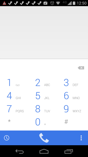
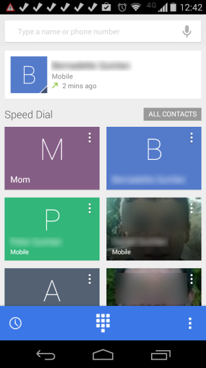
I got my 4.4.3 update a couple of days ago, and I'm not real happy with the new look of the dialer. What do you think? (pictures shown for those who don't have the update yet)
 

Attachments

  • Screenshot_2014-06-08-12-50-14.png
    Screenshot_2014-06-08-12-50-14.png
    56.2 KB · Views: 227
  • Screenshot_2014-06-08-12-42-05.png
    Screenshot_2014-06-08-12-42-05.png
    157.9 KB · Views: 229
I like the speed dial

Just wish I didn't have to click all contacts. It would be better to just scroll down to see all contacts
 
I like the speed dial

Just wish I didn't have to click all contacts. It would be better to just scroll down to see all contacts

Honestly I don't see a difference with the new dialer it looks the same as 4.4.2

Posted via Android Central App
 
I'm not really fond of the new color scheme (I prefer a black background), or the fact that contacts on the speed dial screen are now shown in a tile format instead of a list format, with no apparent way to change it. I have relatively few contacts with anything but the stock silhouette icon, so larger icons in a tile format does nothing for me.

It really bothers me when someone in development imposes their own personal preferences on a UI thinking it will widely be considered an improvement. Aside from that though, it bothers me is this change to a white background on a device with an AMOLED screen. The previous UI with a black background was more battery friendly.
 
Interestingly enough because I've heard 4.4. 3 is a battery operated on the phone as well. I figured they would with a white background for the dollar because tickets color theme is white in general

Posted via Android Central App
 
I'm not really fond of the new color scheme (I prefer a black background), or the fact that contacts on the speed dial screen are now shown in a tile format instead of a list format, with no apparent way to change it. I have relatively few contacts with anything but the stock silhouette icon, so larger icons in a tile format does nothing for me.

It really bothers me when someone in development imposes their own personal preferences on a UI thinking it will widely be considered an improvement. Aside from that though, it bothers me is this change to a white background on a device with an AMOLED screen. The previous UI with a black background was more battery friendly.

The previous version of the dialer had a white background too.

Sent from my XT1060 using AC Forums mobile app
 
I like the speed dial

Just wish I didn't have to click all contacts. It would be better to just scroll down to see all contacts

Srsly, wtf. I kept thinking i must be missing it. Sometimes they make the most ridiculous choices. This has been the case for all my stock android dialers starting from 4.2. I dont get it. Every other dialer goes from dial pad to contacts and then vice versa with 1 button. Except for stock android dialer.
 
The previous version of the dialer had a white background too.

Sent from my XT1060 using AC Forums mobile app
The speed dial screen had a white background, but the dialer background was black.

Sent from my Moto X using TapaTalk
 
I like the white. I'm not a fan of black backgrounds so I like this change. I will wait until I get the update to decide on the contacts. I'm not a fan of how it is now so hopefully I'll like the new better.

Posted via Android Central App
 
how long did it take to download the 4.3.3 update? Mine has been going on since the last 4 hours...!!!!!!
 
Anyone know how I can find the color code for that blue they're using in the new dialer?
 
I agree with so many of these comments. I’ll try to be positive – it’s bright and trendy looking. That’s it.

Linear dialling lists are far more efficient – a basic UI design rule. Start menu or the hated Windows 8 screen? no contest. Our eyes are not good at searching left to right AND up and down too. A backwards step. At least the dialling history is still linear – shame I can’t get that to come up as the default, or select linear for the most dialled screen.

The dialling pad is lower contrast than before (pale blue on white - really?) which is a problem if like me your eyesight is OK without glasses, but not great. Poor UI design again. White on black or vice-versa cannot be improved on. I hope I can change the colour scheme so I shall get that sorted.

Contacts list is not changed much, meaning no better. However, just as in Gmail, the big capital letters in both lists are a complete distraction and I find myself ignoring them and scanning only the names. Our eyes and brains are extremely good at pattern recognition such as complete names. The caps just slow me down and waste useful space. I don’t know if I am supposed to add photos to each contact but please – only children have time for that.

Perhaps the next time the designer will ask people what works well for them instead of just playing with his new set of pastel crayons.
 
Ugh. What were they thinking? That is absolutely hideous and completely unusable with my vision problems. Back to the drawing board. Both Apple and Google have jumped the shark with their color and design choices lately. Ugly as sin, both of them.

Posted via Android Central App
 

Members online

Forum statistics

Threads
959,562
Messages
6,979,779
Members
3,164,285
Latest member
witnessloc12