- Dec 4, 2012
- 35,590
- 541
- 113
I have noticed Zero Launcher climbing higher on Plays list for launchers. So, on the 6th of December, I decided to download it and give it a try.
Before I dive into my review of it, I will give out some basic statistics for the app. These are, of course as of December 6th.
App Size: 1.82 MB
Last update: 12-6-2014
Version: 2.01
Download count: 10,000,000+
Device tested: Nexus 5 on WiFi.
I only played around with this launcher for about 30 to 45 minutes. I will break this down to the Good, the Neutral, the Bad, and the Ugly.
The Good
-There is a widget that acts like Power Toggles. This widget can also be placed or removed from the Notification shade. To a large degree, this is quite nice. I have never been a big fan of the quick toggles on a separate page, but I have grown used to them.
-Some very nice highly defined wallpapers. Games, animals, and nature scenes are varied. There is a pretty cool picture of a bolt of lightning.
-Downloadable icon themes, and a one click shortcut to change them.
The Neutral
-3D screen effects. Sure almost every launcher has them, but these have a little more thought behind them. The only thing is...there are 3 total. One is the classic Card Stack that most other launchers, even stock AOSP ROMs have. The other 2 are pretty cool. I honestly was hoping for more, but to keep the launcher light (the 1.8 MB) things have to be cut somewhere.
The Bad
-Free Premium Themes....misleading. Disclaims being no longer free once a different launcher is selected as Default.
-Memory Boost. Further feeding on how Android is NOT supposed to be run*
The Ugly
-Limited customizing. Again, I realize things have to be cut out to keep the app file size down. However, at least in my opinion, too much has been sacrificed for size. There are only 2 choices for a grid layout (4x4, and 5x4)
-There is no App Drawer. Or to look at it the other way around: you are constantly in the App drawer. Yes, all your apps are now on your homescreens, effectively giving you Apple's UI.
This was where this launcher lost me. I am one who likes having an App Drawer and homescreens. There are plenty of apps that I don't need to open, and therefore, don't need to see them on my home screens.
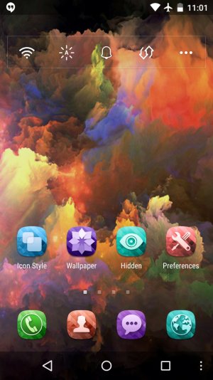
Showing the onscreen quick toggles.
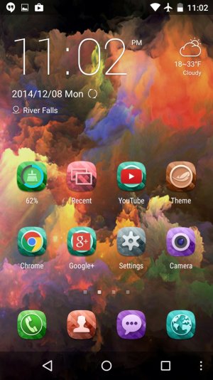
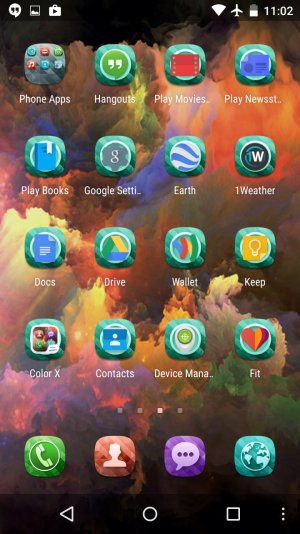
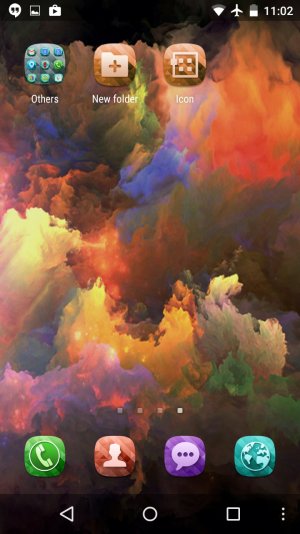
The above 3 screenshots showing all my screens.
* Android likes having RAM full.
http://forums.androidcentral.com/ambassador-guides-tips-how-tos/380592-guide-ram-android.html
http://android-developers.blogspot.com/2010/04/multitasking-android-way.html?m=1
Before I dive into my review of it, I will give out some basic statistics for the app. These are, of course as of December 6th.
App Size: 1.82 MB
Last update: 12-6-2014
Version: 2.01
Download count: 10,000,000+
Device tested: Nexus 5 on WiFi.
I only played around with this launcher for about 30 to 45 minutes. I will break this down to the Good, the Neutral, the Bad, and the Ugly.
The Good
-There is a widget that acts like Power Toggles. This widget can also be placed or removed from the Notification shade. To a large degree, this is quite nice. I have never been a big fan of the quick toggles on a separate page, but I have grown used to them.
-Some very nice highly defined wallpapers. Games, animals, and nature scenes are varied. There is a pretty cool picture of a bolt of lightning.
-Downloadable icon themes, and a one click shortcut to change them.
The Neutral
-3D screen effects. Sure almost every launcher has them, but these have a little more thought behind them. The only thing is...there are 3 total. One is the classic Card Stack that most other launchers, even stock AOSP ROMs have. The other 2 are pretty cool. I honestly was hoping for more, but to keep the launcher light (the 1.8 MB) things have to be cut somewhere.
The Bad
-Free Premium Themes....misleading. Disclaims being no longer free once a different launcher is selected as Default.
-Memory Boost. Further feeding on how Android is NOT supposed to be run*
The Ugly
-Limited customizing. Again, I realize things have to be cut out to keep the app file size down. However, at least in my opinion, too much has been sacrificed for size. There are only 2 choices for a grid layout (4x4, and 5x4)
-There is no App Drawer. Or to look at it the other way around: you are constantly in the App drawer. Yes, all your apps are now on your homescreens, effectively giving you Apple's UI.
This was where this launcher lost me. I am one who likes having an App Drawer and homescreens. There are plenty of apps that I don't need to open, and therefore, don't need to see them on my home screens.

Showing the onscreen quick toggles.


The above 3 screenshots showing all my screens.
* Android likes having RAM full.
http://forums.androidcentral.com/ambassador-guides-tips-how-tos/380592-guide-ram-android.html
http://android-developers.blogspot.com/2010/04/multitasking-android-way.html?m=1
Last edited:

