A
AC Question
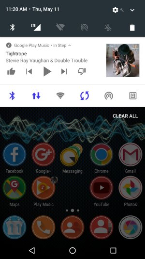
Already Android made a distinctive look for music in the notifications bar.like the moment when you hit the first song,you have a bar at the top of your notification for music.you can like and dislike and even skip songs just from the Noti-Bar.and one of my favorite features is the album art in the lock screen.the only thing that bothers me is that no matter how you see it,The music bar still looks the same as other notifications.what I mean is all these Bars look alike and so does the music Bar.it would be great if they designed the music Bar into its own signature look.Idon't really know,but some thing to keep it different from any other notification.Some option I could think of is have the music Bar connected to the control center Bar,or keep it the way it is but have a line divided between the music Bar and the regular notifications.Another thought was have pages in the control center and from the second page you see a new music Bar in the control center.i thought of this one from the iphone.But yea,if you can get this to work that would be the coolest thing for Android 


