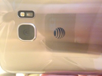
The bigger question is: do we still get the terrible generic AT&T box for our phones or do we actually get the really nice packaging that Samsung came up with here? I just don't get why AT&T feels like it has to use its own generic box for everything...
 Twitter