Hello all. I just got my G4 today and I'm disappointed with the display. I'm coming from the galaxy s4 and s5. The colors were more accurate and had better contrast. With the G4, the blacks aren't as rich and the color hue isn't quite right. This is important to me.
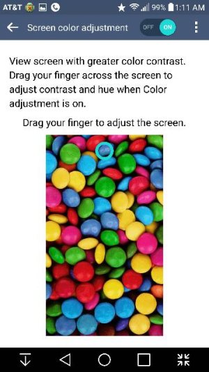
I went into the screen color adjustment option (accessibility>vision) and that's frustrating in of itself. They picked a poor sample image (wish you could choose different images) and instead of having a seperate slider to control hue, saturation, and contrast, you drag your finger around and it changes all them when you only want to change one. So far whenever I fix one color it messes up something else. The reds are either too pink or too orange, fix that and then the yellows or greens get messed up. Skin tones look wrong. Try fixing the contrast and everything gets grossly oversaturated or weird looking.
Are there any presets to choose from? Any tips? Do I just have a bad unit or are others experiencing this?
 Twitter