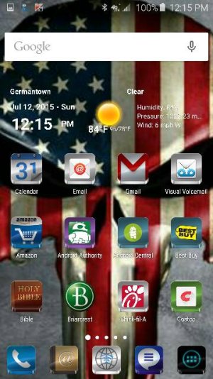
I like the lack of clutter. In that regard, I struggle with finding the right balance between form and function. I've had my setup for a long, long time, in terms of app icon layout.
In terms of "function", I prefer to keep my most used apps at a single click from unlocking. My second page has folders for lesser used apps (ie: Travel, Shopping, Video, Audio, Games, etc) and my third page simply consists of my Google Keep widget and my Google Now widget. My dock is a little more congested, but each app on it serves its purpose well. I've contemplated combining FB and Twitter into a folder in order to move my calendar app off the dock (to loosen it up a bit), but I'm trying to avoid extra clicks.
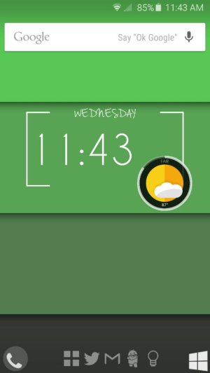
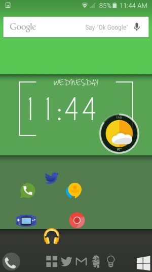
As for "Form", I like having a simple widget (clock and weather, in this case) on my homescreen to break up the monotony of a solid grid of icons. I also leave empty space around to to help that feeling. I have only 1 folder on my main screen, as folders equal an extra click to get to the app.
Silly, I know, but that's how I roll!
What's that app/widget you have at the bottom? Is it like folders?
")


 Twitter