Google Maps update

HULKchampion

Well-known member
Aug 30, 2012
227
0
0
How are you guys liking the update? I personally like it a lot, but there's two minor quirks bugging me.
1) Our menu button does absolutely nothing... :-(
2) I don't like having to swipe seeing the next direction instead of older version tapping it.

Other than that, like I've said earlier. It's a welcome update. I'm interested in your opinions and findings of bugs too.
 
Hate it. They got rid of Latitude, said Google+ would be the replacement...it isn't by a long shot. Got Real Gps Tracker instead.

Sent from my SPH-L710 using Tapatalk 2
 
I actually think it's a lot cleaner and smoother than before.. I kinda had a mini heart attack when the menu button didn't have any response, but I noticed the little white box, and opened my settings there.. One thing I have noticed is that I still have Navigation and Local in my app drawer, and they both still function.. I don't know if that's because I am rooted or what, but either way I am impressed with the update..
 
I don't have "navigation" in my apps anymore! LAME!! cause that's the one i used all the time, how come tat does? No fair. Anyone have an apk for that? I would love to have that back. I'm rooted with the M.O.A.R too

It is a nice update though.
 
I don't have "navigation" in my apps anymore! LAME!! cause that's the one i used all the time, how come tat does? No fair. Anyone have an apk for that? I would love to have that back. I'm rooted with the M.O.A.R too

It is a nice update though.


I was able to play around with an HTC Evo 4G LTE that had received the update last night, and it had lost the Navigation and Local apps.. To get to Navigation is a bit of pain in the backside, but you can search an address in Maps, hit the little blue car in the lower right corner, select one of the corresponding routes, then there is a blue triangle in the lower right corner that will open Navigation.. At least they're trying, and we're not being directed to drive into a pond ala iCrap..
 
I'm really not wild about 7.0.2. While I guess it is a bit cleaner and a bit more "hip", there are some features that took significant steps backwards.

I still have my Navigation icon, but it launches to the same thing that maps does. Before, if you had no navigation in progress, you would go straight to a clean screen to choose your destination - easy peasey. Now, not so much.

Where is the official place to log constructive criticism? Is there a Google Group or G+ spot?

My current list of issues - in order of annoyance:

1) Returning to the application does not continue the navigation in progress. Instead, it goes back to asking you for a destination and then which path. Really? Switching to another application and back makes you start over?

2) The destination picking mechanism has taken several steps backward. I much prefer the handful of buttons at the top that had "Home", "Type", "Contact". Below that was Googles amazing _prescient_ list of recent destinations. That list was so good it was kinda scary at first. It would rank recent destinations by recency, as well as by day of week and time of day. Every Monday morning (and only then), I drive to a particular station. Every Monday morning, that destination was at the top position - all other times, it would be off the list or much lower. Now - that all seems to be gone.

3) No obvious way to get to my favorite locations from the choose destination screen. Just the "dumb" list of recent locations.

4) The "choose path" screen went from useful to useless. It used to be a "preview" view with up to 3 highlighted routes on the map. it had 3 buttons at the top to allow you to select which path. That path was then highlighted on the map - so you could see what you selected - and look at traffic. Now the are just three text descriptions - and the descriptions are surprisingly bad (given Google usually gets stuff like this right).

Many more...

20) No support for the menu button. Really? They couldn't make it duplicate the menu icon functionality? Given that even Google can't decide where to put the menu icon - and what it should look like (now it is in the lower left) please support phones that have a menu button - it is always in the same place and takes up no screen real estate.
 
Sheesh.

There are lots of things not to like about the new maps update. but no one "lost" navigation. Navigation was never a separate app. The nav icon was just a different entry point into maps. You could, and can, use navigation from within the Maps app.
 
I hate the update, is there anyway to go back to the previous version? There doesn't seem to be an 'uninstall updates' option


Sent from my Sprint Samsung Galaxy s3 running Liquid Smooth v2.7 with a 7000mah extended battery powered by ZeroLemon... Because I'm not a chick, a guy with dainty hands or an HTC one user :p
 
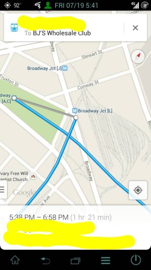
My issue is on the previous version, if ur looking at directions and then tap the little white circle, it would tell you what you needed to do (turn left, etc), but on this version, you can't tap the bubbles

For example (blurred out some stuff for privacy)

1374270156569.jpg

You used to be able to touch the white bubble and it would tell you that you need to turn or take another bus or something. Now it does nothing


Sent from my Sprint Samsung Galaxy s3 running Liquid Smooth v2.7 with a 7000mah extended battery powered by ZeroLemon... Because I'm not a chick, a guy with dainty hands or an HTC one user :p
 
I'm really not wild about 7.0.2. While I guess it is a bit cleaner and a bit more "hip", there are some features that took significant steps backwards.

I still have my Navigation icon, but it launches to the same thing that maps does. Before, if you had no navigation in progress, you would go straight to a clean screen to choose your destination - easy peasey. Now, not so much.

Where is the official place to log constructive criticism? Is there a Google Group or G+ spot?

My current list of issues - in order of annoyance:

1) Returning to the application does not continue the navigation in progress. Instead, it goes back to asking you for a destination and then which path. Really? Switching to another application and back makes you start over?

2) The destination picking mechanism has taken several steps backward. I much prefer the handful of buttons at the top that had "Home", "Type", "Contact". Below that was Googles amazing _prescient_ list of recent destinations. That list was so good it was kinda scary at first. It would rank recent destinations by recency, as well as by day of week and time of day. Every Monday morning (and only then), I drive to a particular station. Every Monday morning, that destination was at the top position - all other times, it would be off the list or much lower. Now - that all seems to be gone.

3) No obvious way to get to my favorite locations from the choose destination screen. Just the "dumb" list of recent locations.

4) The "choose path" screen went from useful to useless. It used to be a "preview" view with up to 3 highlighted routes on the map. it had 3 buttons at the top to allow you to select which path. That path was then highlighted on the map - so you could see what you selected - and look at traffic. Now the are just three text descriptions - and the descriptions are surprisingly bad (given Google usually gets stuff like this right).

Many more...

20) No support for the menu button. Really? They couldn't make it duplicate the menu icon functionality? Given that even Google can't decide where to put the menu icon - and what it should look like (now it is in the lower left) please support phones that have a menu button - it is always in the same place and takes up no screen real estate.

Couldn't have said it better. It's like health care: the more improvements your company makes to your plan, the less YOU get.
 
The new update is fine people just complain about things that are new and a little different, everybody will get used to it if they give it a real try.
 
The new update is fine people just complain about things that are new and a little different, everybody will get used to it if they give it a real try.

While there are some nice things in the update and an improved ui, there are things missing. It's not as good as the previous version Imo

Sent from my Sprint Samsung Galaxy s3 running Liquid Smooth v2.7 with a 7000mah extended battery powered by ZeroLemon... Because I'm not a chick, a guy with dainty hands or an HTC one user :p

Agree, update is not as good as the previous version. We lost good features to get something different. We will get used to it. Update: the way to view alternate routes visually requires one extra step. You have to select the alternate route text, but you can go back before you command navigation and choose another one.
 
Last edited:
The new update is fine people just complain about things that are new and a little different, everybody will get used to it if they give it a real try.

It's fine. Unless, of course, you made use of one of the features that they just completely removed. Or actually use Nav while driving, where the new version requires you to take your eyes off the road, and hands off the wheel, more than the old one did. Different for the sake of difference is rarely a good idea. If they actually made it easier to use, rather than just prettier, that would be one thing, but prettier and harder to use is a bad trade-off.
 
Too many changes at once. Oh well, adapt and overcome...

Posted via Dope Android Central App
 

Latest posts

Trending Posts

Forum statistics

Threads
956,867
Messages
6,970,411
Members
3,163,644
Latest member
RichardDixon