- Mar 8, 2014
- 3
- 0
- 0
Hi all,
This is an issue that annoys me with the Google Play Music app (also in the Music app on my GS4 mini).
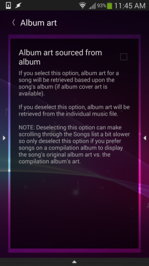
For example, say I have a miscellaneous list of tracks of the same genre so using mp3tag on my PC I give this collection the album tite "Pop MP3 Collection". I have used mp3tag to give each track in the last its correct individual art work, e.g. the art that single was released with. Each track has its own different art embedded into its tag but because they are all in the same "album" Google Play Music will pick one art and assign it to all tracks in that album (fine for a compilation album). This annoys me a lot. iTunes on my PC doesn't render like this and picks up the individual artwork correctly, as does VLC and WMP. Samsung stock music player has the same annoying issue as Google Play Music.
Trying a few apps on my phone Poweramp is an example of one that does work correctly picking individual tracks artwork. All files are correctly tagged so I know its the way the Google Play Music app sees it just. I think this is a bad design flaw and its the same problem when uploading tracks via Music Manager. Apple have had this correct with iTunes for a long time.
Some might say I am been fussy but it just annoys me they can't do it right. Correct art on screen when listening is important to me.
I'd like to use Play Music but my question is anyone aware of way to fix this? Or does anyone understand what I am saying?
Cheers


