Likes and Dislikes of Android Pie & One UI so far...

When you swipe up it automatically puts your last app up on top so all you have to do is swipe and tap. Almost as fast. Maybe a milisecond shower but it seems they were conscious of the issue.
As I have brought up in another thread or two, I do not like how I cannot toggle between recently opened apps when using the gestures (in the same way as when you double-tap recent apps when not using gestures). I hope maybe I'm just missing something here, because I'd like to give gestures a chance.
 
As I have brought up in another thread or two, I do not like how I cannot toggle between recently opened apps when using the gestures (in the same way as when you double-tap recent apps when not using gestures). I hope maybe I'm just missing something here, because I'd like to give gestures a chance.

If Samsung had stuck with Google's (admittedly imperfect) gestures instead of trying to invent their own bad ones, the capability would be there.
 
Re: Likes and Dislikes of Android Pie & One UI so far...

I dislike mostly the same things as you. I much prefer them stacked and I'm really not liking it automatically shifting over one app when in that screen.
I absolutely do not like that I couldn't hide the buttons at the bottom so I was forced to do gestures. They've grown on me some but I'd prefer the old way.
My one widget I had now no longer works.
Because I have a theme I can't turn on night mode, so a lot of my stuff is white when it used to be black and I hate it.
I dont like the shape changes either.
My keyboard has taken on my theme but now at the bottom there's a weird grey bar and it's driving me mad.

Edit oh, and I don't like the time being moved I feel like an old dog who refuses to learn new tricks.
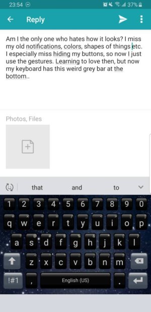
I honestly regret switching. The only main positive I can think of right now is being able to see multiple texts from one person in the notification bar instead of just the last one. Which really sucks because that was the huge thing I was excited for with this update and now it doesn't feel like it's worth it. Screenshot_20190201-235429.jpeg
 
Samsung, why did you install Kids Home Installer?
How do I remove and uninstall this and other "bloat?"
One of the reasons I don't like Samsung.
I thought u had turned off auto updates from Galaxy App. Screenshot_20190202-064854_Settings.jpeg
 
As I have brought up in another thread or two, I do not like how I cannot toggle between recently opened apps when using the gestures (in the same way as when you double-tap recent apps when not using gestures). I hope maybe I'm just missing something here, because I'd like to give gestures a chance.

Seems easy for me. I swipe up and my finger is right above the place where I need to tap to get to the previous app in one continuous motion. Basically, swipe up and tap.
 
Seems easy for me. I swipe up and my finger is right above the place where I need to tap to get to the previous app in one continuous motion. Basically, swipe up and tap.

That's not what they're talking about. On Oreo you could double tap and it would switch to the last app. On the stock gestures, you hold and move the 'pill' back and forth and it will switch between open apps without you needing to go into the task switcher.
 
That's not what they're talking about. On Oreo you could double tap and it would switch to the last app. On the stock gestures, you hold and move the 'pill' back and forth and it will switch between open apps without you needing to go into the task switcher.

I know what they're talking about and IMO it's first world problems. You still get two switch with two finger motions either way.
Anyway, the on the stock gestures, Force touch on home button area, swipe to recents position, then back and swipe again still works for switching to previous.
 
Maybe I missed something but is there any way to force Google apps to use the dark theme. I thought the pie setting was global across all apps but apparently not....
 
I know what they're talking about and IMO it's first world problems. You still get two switch with two finger motions either way.
Anyway, the on the stock gestures, Force touch on home button area, swipe to recents position, then back and swipe again still works for switching to previous.

But that is not actually what they're talking about. You're talking about using the task switcher. There is a fast switch gesture to get to the last app quickly with Google's gestures that doesn't exist with Samsung's.
 
So far, the only thing I am not crazy about is how big the notifications are. There's so much wasted space, I could see more notifications if there weren't so many open spaces. Each notification does not need that much buffer above and blow. (I'm talking about the notifications you see after dragging down.)
 
I just updated mine, so I am still getting used to it. I will say that the notification clock change is really annoying.

I think that the dumbed down settings screen is a problem as well.
 
I still have the dolby atmos error... Keeps switching off on its on... Rest I love the one ui...
 
But that is not actually what they're talking about. You're talking about using the task switcher. There is a fast switch gesture to get to the last app quickly with Google's gestures that doesn't exist with Samsung's.
A double tap vs 2 swipes vs a swipe and tap. Is it really that different?

Anyway as I said, there is a hidden double swipe action on the Samsung gestures. Force touch over home area then double swipe horizontally towards recent button.
 
When you swipe up it automatically puts your last app up on top so all you have to do is swipe and tap. Almost as fast. Maybe a milisecond shower but it seems they were conscious of the issue.

Don't find that as convenient or quick personally. We'll use gestures more.
 
In early articles, they said they were providing the space at the top to move the relevant information closer to the bottom, to make it easier for one-handed operation! It does that, even if it does look like wasted space!
So far, the only thing I am not crazy about is how big the notifications are. There's so much wasted space, I could see more notifications if there weren't so many open spaces. Each notification does not need that much buffer above and blow. (I'm talking about the notifications you see after dragging down.)
 
In early articles, they said they were providing the space at the top to move the relevant information closer to the bottom, to make it easier for one-handed operation! It does that, even if it does look like wasted space!

I dont think they wasted space , they put well thought into the one UI and its really good. You probably see other manufacturers copy this in 2019.
 

Forum statistics

Threads
955,484
Messages
6,964,929
Members
3,163,288
Latest member
adityaj