New Forum Design: Official Feedback Thread

So when we first started testing this, it was mostly just the moderators and ambassadors testing it (for a few weeks before it went wide). Our number one thing was to make sure the functionality isn't lost. On day 1 everything was broken and we literally couldn't do our jobs. Fast forward just a few months and 90% of the functionality is back, even if it's slightly different in exactly how it works.

The reason this thread is so important is that the devs are actually listening, and considering the huge size of the project and the tiny size of the team, they're working at a very fast rate. Most of what I'm seeing indicates that perhaps the beta could have been a little longer, but I haven't seen a single thing that makes me think they should scrap the whole thing and revert.

Moving forward from where we are is not only easier, but just seems like a much better idea. So that's the only reason I'm in this thread, because I want what this will become to be awesome ... And that's what I'm continually asking everyone else to think about... How do we take this, what it is now, and make it better?
 
@nahoku : I'm with you there's a lot of work toDo to return those

AC-Question=Guests and other users, who don't ask anymore

questions and You know What-Androids I've monitored

the flow of New questions using an app and have

Decreased since this AC-GUI change :cool:
 
If the devs are really "listening", then they should reinstate AC 2012. It's not like it's gone. It can still be navigated and used if you don't log in. Unfortunately, there's no way to post without logging in, and then you lose AC 2012.

I know you must have noticed that those here complaining are not new members. It's those that use the site. And just like you guys who couldn't do your "job", we can't do ours (although it's not a job for us).

If it weren't for the people who care about this site, there wouldn't be any feedback. Why is this so difficult to see?

The site "as is" is not fully functional as it should be, so until then, why not reinstate AC 2012, and leave Mona to those who want to use it while it's being worked on?

As I stated, I would "almost" have no problem with Mona if it were fully functional... besides the fact that it gives me a headache trying to read it!


Most of what I'm seeing indicates that perhaps the beta could have been a little longer, but I haven't seen a single thing that makes me think they should scrap the whole thing and revert.
No one's asking for a scrap or reversion. Is that what you really think reading all the feedback here? People are asking that the AC 2012 be left as an option to use. It's not broken, so if it were an option, they wouldn't have to do anything to it. Many websites I use have different themes, and while the original themes have long gone, the replacements are "better" with nothing missing. I assume that one day, Mona may become just as effective, but right now, it isn't, no matter what people think. It's just too obvious or you wouldn't see the negative feedback about it. Might not be what they hoped to see, but it is what it is.

The devs might be listening, but they're not really "hearing" anything!

Anyways, I'm not going to argue the point anymore. But just to be clear, I'm not asking that Mona be scrapped, just let me use AC 2012 until the bugs are worked out and full functionality returns.

You can't imagine how useless I feel my comments are!
 
@nahoku: While those who are in Charge or have the power to make Changes on this website
like -Almeuit:Aquila- We know they're No part of the Dev-Team changes, but their
opinion has Weight on the Developers: Let's let them do their job
They would deliver the best AC-GUI for us :cool:
 
Hey everyone - let me try and respond to some of the recent questions.

This seems like change for the sake of change!
Not at all - we've planned this change for the last year with some very specific objectives in mind. We have a very limited dev team and over 10 full sites to manage so if something does not need change...it does not get changed. You can read some of our reasoning here: Our new forums are here! | Android Central

Our absolute main objective was to make the forums more accessible to users who are not used to VBulletin style forums - or more hardcore Forums in general - without loosing any core functionality. We particularly wanted to be more welcoming to traffic coming directly from Google (over 85% of our Forum traffic).

One week in we see that we have improved our Bounce Rate from 37% to 10% - this is a huge improvement and means that thousands more visitors are staying long enough to actually read the content of a Thread.

In addition our code foundation was very old and tough to work with so new features or big fixes were left on the back burner and never got done. A great example of this is the new Dark Theme - something we were able to turn around very quickly thanks to the new code base and style.

So two simple objectives - make Forums appeal to non-forum visitors and update an aging code base.

I hate how this is being handled - you are just doing what you want
We have run a closed Beta for 2 months and an open Beta people could access for the last month. We’ve gathered pages and pages of feedback. Some of it here: http://forums.androidcentral.com/si...ack-thread-new-forum-design-beta-version.html

We’ve also had a private Slack chat room with 40 moderators and ambassadors for the last 2 months where they have given their ideas and feedback.

Thank you for the informative reply. I read through the link on the changes and reasonings, and it did shed light on things. The comparative pics put things into perspective as well. Also nice to see that the changes have resulted in improvements in site activity and speed overall.

That said, my disagreements come down to personal preference. I.e. the colors issue. When it comes to the VB vs the current style, there are things I like about both but would prefer VB overall. It's really not that hard to use. The snarky side of me would respond to the concept of making it more like a social media site that "kids these days got it too easy, and there's more to conversation than using the latest emoji." *Shakes a cane angrily while also muttering something about getting off his lawn*

I will also toss my vote in with keeping the 2012 layout as an option while working out the remaining bugs in the new style. I don't think this is too unreasonable of a request as a temporary measure.

I did pick my wording rather specific in my last post. I was never trying to insinuate that you guys are being truly heartless to the concerns of users (intended or not), but rather, expressing how the responses or lack thereof thus far can be perceived.
 
Hey everyone - let me try and respond to some of the recent questions.

This seems like change for the sake of change!
Not at all - we've planned this change for the last year with some very specific objectives in mind. We have a very limited dev team and over 10 full sites to manage so if something does not need change...it does not get changed. You can read some of our reasoning here: Our new forums are here! | Android Central

Our absolute main objective was to make the forums more accessible to users who are not used to VBulletin style forums - or more hardcore Forums in general - without loosing any core functionality. We particularly wanted to be more welcoming to traffic coming directly from Google (over 85% of our Forum traffic).

One week in we see that we have improved our Bounce Rate from 37% to 10% - this is a huge improvement and means that thousands more visitors are staying long enough to actually read the content of a Thread.

In addition our code foundation was very old and tough to work with so new features or big fixes were left on the back burner and never got done. A great example of this is the new Dark Theme - something we were able to turn around very quickly thanks to the new code base and style.

So two simple objectives - make Forums appeal to non-forum visitors and update an aging code base.

I hate how this is being handled - you are just doing what you want
We have run a closed Beta for 2 months and an open Beta people could access for the last month. We’ve gathered pages and pages of feedback. Some of it here: http://forums.androidcentral.com/si...ack-thread-new-forum-design-beta-version.html

We’ve also had a private Slack chat room with 40 moderators and ambassadors for the last 2 months where they have given their ideas and feedback

It’s so broken I cannot use it
This is categorically not true but we understand some things are still not working as they are supposed to. This is part of the pain of any launch. We had a perfect working Staging environment but when we pushed live we still saw many issues. This is an issue of course and our developers have worked long days for the last week to fix what is broken.

We also struggled to test everything - there are features some of you use that did not even come up in our 2 month beta testing - VB is pretty complex…we are tackling these as fast as we can.

Everything is too big
It appears as if most people complaining about this were actually using the full Desktop version of the old forums on the mobile. We did not expect this but are building a way for you to force the Desktop version whatever device you are on.

Too Long Did Not Read
The redesign had some very good reasons for happening or it would not have happened - we are working hard to deal with features that broke when we pushed live.

My complaint about the big fonts and lack of contrast was on desktop view using desktop Chrome on a desktop PC. Yes, this post is from a mobile device, but I'm struggling to use the forums on a PC more than on a mobile device.
 
I finally realized what it is about the Mona style that makes it so visually unappealing to me (besides the fonts being raggedy and grey(?))... all the separator lines are missing between the forums and threads lists. No wonder I felt uncomfortable looking at it! Yup, this is like seeing Lollipop on my desktop! Sorry, I'm a Kitkat fan, so I like to see distinct borders between things... makes it easier to read. I really like Aquilla's take on material design being a fail... I couldn't have said it better!

Sorry it's not feedback, it's just a revelation of discovery for me! My only excuse is that I haven't been visiting the site as much as I used to.
 
I may just be blind and not seeing it, but there doesn't appear to be any way to search the forums. For moderators/ambassadors that's critical functionality (search by username, search by keyword, etc) - and I assume that it's probably useful for a lot of other people since we ask people to search the forums for existing threads prior to creating a new thread to avoid duplicate topics.
 
I may just be blind and not seeing it, but there doesn't appear to be any way to search the forums. For moderators/ambassadors that's critical functionality (search by username, search by keyword, etc) - and I assume that it's probably useful for a lot of other people since we ask people to search the forums for existing threads prior to creating a new thread to avoid duplicate topics.

From what I can see, it is under the tools menu, next to the page count of the thread. While it seems to default to this thread, it also has the Advanced Search option. I do agree that it seems to be missing on the top level, when looking to select a forum. It appears to only be when you are within a forum or a particular thread.
 
I may just be blind and not seeing it, but there doesn't appear to be any way to search the forums. For moderators/ambassadors that's critical functionality (search by username, search by keyword, etc) - and I assume that it's probably useful for a lot of other people since we ask people to search the forums for existing threads prior to creating a new thread to avoid duplicate topics.

Well there are a couple ways, under tools, is an "advanced search" everyone should have access too, which can find threads and user names. There's also the search tool at the very upper right which searches forums, blogs, etc, AND as a Mod/Admin you should also be able to do a Passport Search (regular members can not do this) click on your profile picture at the upper left, then click on your user name, THEN select Passport Admin, you'll see it. You can search the member list that way. :)
 
Thanks guys, didn't know it got moved there.

The Admin Control Panel has a search tool also which you probably have access too. ;) (Again this is not available to regular members and is only available to Admins)
 
Oh, and I'm still getting emails every time someone quotes me. I can't find anything in settings to turn that off. If there is a way, please tell me exactly where it is.
 
Is it me (my browser) or has the ability to click on a user's "forum posts" been disabled?... in the avatar section.

I'm asking because it's useful to see if a user has posted multiple posts on the same subject in the same or different forum.
 
Is it me (my browser) or has the ability to click on a user's "forum posts" been disabled?... in the avatar section.

I'm asking because it's useful to see if a user has posted multiple posts on the same subject in the same or different forum.
I think that's moved to clicking on the picture then clicking posts from the resulting menu.
 
Couple of things...


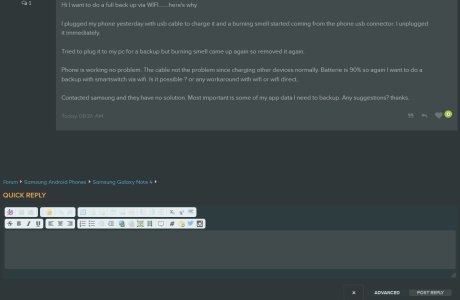
1) Why is it that when you open a thread to read it, the top of the page, to include the title, gets cut off and all you see is the thread comment? This happens on any thread that has no replies.

Like this...


ScreenShot001.jpg


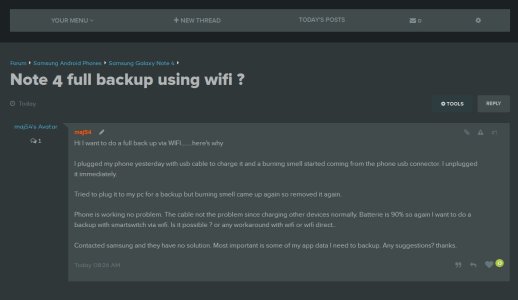
Why doesn't it show up like this... I always have to scroll up to see the top information.


ScreenShot002.jpg


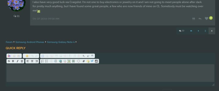
2) Why when you open a thread with multiple replies, the thread opens to the last reply?


Like this...


ScreenShot003.jpg


Why doesn't the thread open to the first post?


Since AC will not listen to users about AC 2012, I've actually been trying to make sense of Mona to see if I can get used to it (besides having a hard time reading with it's color scheme). The functionality I'm seeing is making it very hard for me to even begin using this forum again! I would like all threads to open to the first page of the thread... with all the top info showing. Am I missing a setting somewhere in my preferences? This is happening on Firefox and Chrome on a desktop. I don't use any other browsers.
 

Forum statistics

Threads
955,754
Messages
6,965,725
Members
3,163,389
Latest member
11september11