New front page redesign feedback!

It made my eyes bleed this morning, but it is starting to look better. Did you do some additional work?

One suggestion is to make all articles left-aligned, even the ones with the full-column photos. Otherwise, it looks like a formatting error to me. I know what you're doing, because you don't want lines that long so you're centering, but bit doesn't look right. Maybe a vertical 10-pixel color bar on the left of the head and text would work?

Looks like the right sidebar is mostly a WIP now and I'm thinking it will look less random when there is a consistent right border. Having an ad jump around with scrolling and jumping other full bleed ads makes things look unfinished and random.

Not a fan of the gray box around the popular discussion headings. Maybe some sort of logo to the left saying "From the Forums" to set it off would help.

I would seriously consider adding a 1 pixel border around pictures with significant white in them like the Samsung Level U article. Otherwise you have an odd-floating object.

Finally, I think your headline kickers are too small and light colored. They could be larger and in italics. They're hard to notice.

I get it. Web design is hard in these days of multiple-size browsers and mobile devices... along with getting eyeballs on ads that pay the bills. Good luck with your choices. I know you'll figure it out.

Posted via Android Central App
 
I'm not a fan of all the ad's. I know its a must I give on that. I don't know where one ad stops and the article's start.
 
Yuck...way too busy! so bad I took the time to seek others mentioning it and found this thread on it

Wayne
 
One suggestion is to make all articles left-aligned, even the ones with the full-column photos. Otherwise, it looks like a formatting error to me. I know what you're doing, because you don't want lines that long so you're centering, but bit doesn't look right. Maybe a vertical 10-pixel color bar on the left of the head and text would work?

Looks like the right sidebar is mostly a WIP now and I'm thinking it will look less random when there is a consistent right border. Having an ad jump around with scrolling and jumping other full bleed ads makes things look unfinished and random.

Not a fan of the gray box around the popular discussion headings. Maybe some sort of logo to the left saying "From the Forums" to set it off would help.

I would seriously consider adding a 1 pixel border around pictures with significant white in them like the Samsung Level U article. Otherwise you have an odd-floating object.

Finally, I think your headline kickers are too small and light colored. They could be larger and in italics. They're hard to notice.

I get it. Web design is hard in these days of multiple-size browsers and mobile devices... along with getting eyeballs on ads that pay the bills. Good luck with your choices. I know you'll figure it out.

Posted via Android Central App
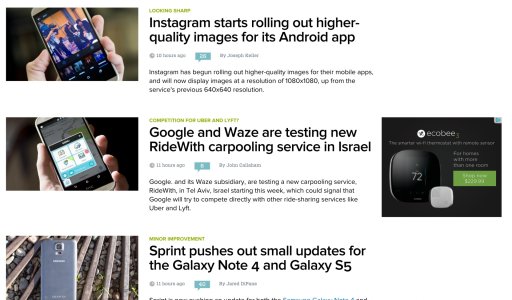
Agree with almost all of this -- what the new layout needs are more simple visual cues that break up the page for the viewer. Ads are fine, but not when they interrupt the page layout so much that you have to take a second to determine if what you're seeing is an ad or an article. Forum posts are fine on the main page, too, perhaps even helpful, but again -- some kind of cue that what you're looking at is a forum post and not news would be fantastic. Right now, on a large monitor (I'm using a 27 inch 1080p touchscreen), everything just ends up looking scattered randomly across the screen and without any borders or any kind of breaks to let my eye rest somewhere, it feels so jumbled and confusing.

If I wasn't already a regular reader of Mobile Nations, I probably would never return to this site after seeing it once, and that's pretty sad. :-\
 
Wow. I didn't think the layout could get worse than it already was......oh, how I was wrong. Fewer ads? Really? It's a complete mess. As difficult as it was to tell ads/spam from real articles before, it's nearly impossible now.

Instead of simply making changes for the sake of making changes and then coming here to ask what we think. You really need to use the feedback you receive to make improvements. I guarantee the majority of feedback you got the last time you had a major revamp of the website had to be in the "not good" direction. Same thing this time......you'll be hard pressed to find much positive feedback. It's up to you guys now to do something to rectify it.
 
I can only echo all the above. This last redesign is a disaster. It's just a jumbled, cluttered mess and is VERY difficult to pick out the articles you may be interested in and drill down to. I'm actually considering just not stopping by any more as it is that bad.
 
I really don't care for the frontpage redesign.
  1. Hard to tell stories from ads
  2. Infinite scroll takes too long to load. I liked the old page which had about 10 stories and then a list of previous posts by title at the bottom. I read the site every day and it was easy for me to see what was current and what I may have missed the day before.
  3. I understand that you need ads to support the site and to advertise the store, but I really don't like them mixed into the post feed. If I want to shop, I'll click on the link to shop, most of the time I just want Android news.

Thanks for considering my input.
 
Sorry Phil, but I thought the webpage didn't load correctly and after restarting Chrome figured out it was done on purpose. Headlines, discussion links, ads, and "shop android links" look like they were shot out of a straw onto the page. Different sized pictures all over the screen, headlines sometimes on the side sometimes in the middle, small titles on top of main titles, the title font is HUGE .... it's so hard on the eyeballs. Skimming through and figuring out what to read is more work than it's worth to me.
 
The new layout is a mess, no consistency and completely confusing. This looks like it was designed by a marketing department to confuse people to get ad and shop traffic up. This has not been designed by anyone with knowledge of a good UX. Too many different sizes, no idea what anything is. It's just a jumble of posts, shop, forums, ads. I'm here lie most on the front page to see what's new and catch up wth the latest articles, this experience is basically destroyed by your new layout. I understand the need to bring more attention to other parts of your site and monetisation, but doing it by confusing is entirely the wrong way to do it, Make posts consistent across the page and make it easy to distinguish between different things.
 
Don't read forum posts and don't shop for android stuff here, really wish I had some option to remove those from the main page. Even if I navigate to the News articles section it doesn't show all the news articles like the newest "Leaked render shows off the Android powered BlackBerry Venice" article doesn't show there...

Really painful on the eyes to navigate through the jumbled mess. Really wish you'd revert it back. It may load faster, but that's the only positive and it doesn't even remotely justify all the negatives.
 
I have to agree with all the comments above. I'm finding the redesign very jumbled and confusing on my Nexus 5. Definitely feels like a work in progress.
The mixing of articles, ads and forum posts with no distinction just doesn't make me comfortable.
Also, something that hasn't been mentioned is the misalignment in the drop-down menu (top right) - I tried clicking on Forums 5 times and it appears it was linking to News instead. In the end I went to the address bar and typed /forums after the url!
 
I find it interesting that rather than post a poll on your main page....or write a post asking what readers think....you post in the forums all the way at the bottom, in an area that most people don't even know exist. I can only conclude that you did so in order to avoid hearing the truth about this redesign....which leads me to believe you won't changed it anyway. The redesign is **** and designed to make people click on ads....which I guess is your main objective.

Is there another way to read this site indirectly? You guys make me miss Google reader.
 
Last edited:
I find it interesting that rather than post a poll on your main page....or write a post asking what readers think....you post in the forums all the way at the bottom, in an area that most people don't even know exist. I can only conclude that you did so in order to hear the truth about this redesign....which leads me to believe you won't changed it anyway. The redesign is **** and designed to make people click on ads....which I guess is your main objective.

Is there another way to read this site indirectly? You guys make me miss Google reader.

My thoughts as well. Nothing on the main blog site about the change, not even on Phil's "From the Editor's Desk" either last week prior to the change or today after the change. It's obviously above his control either way, the change was going to happen regardless. They did the same thing with Windows Central a few weeks ago. So to me this forum thread is worthless. If they truly wanted and valued our feedback it would've been prior to the rollout and prominently posted somewhere to get the most eyes on it. As it is now, I'm very much less inclined to visit the main site. To be bluntly honest, the only thing keeping me here are the forums.
 
The button for the drop down works but when you select from the drop down in mobile nothing works.
 
Just to let everyone know we are listing to your feedback and are making design tweaks.

- Left indention has been mostly removed

If you are logged in:

- All inline ads except for ShopAndroid has been removed
- The forum comments has been removed until we figure out a better design and more relevant threads
 
Its still very hard for me to read. I'm not a web design expert so I can't tell you what to fix, but I can tell you that it doesn't work for me. The most important thing is that I find myself not wanting to click my bookmark for Android Central because I know I will just be annoyed if I do. Its not a good idea to make your visitors not want to use the site. :)
 
Guys, I still can't even tell how to USE the front page...I can't find the articles to even begin reading them! :-( It's so bad...I mean, really, really bad. I don't mind Shop Android; it makes revenue for the site and is easily avoidable if one doesn't like it. But I can't even use the AC site at all anymore. I only use it for the forums now.

The app is the only way I can read the site's news now. Everything is all over the place. It looks like an accident with coding; like there are forgotten closing tags in the code somewhere or something.
I can't tell what's an article, what's an ad, what's something else entirely...I don't know, it's just one huge pile of chaos!

However, I truly appreciate you guys trying something new!

And I do think taking one of the forms of content (hot-topic forum posts) out of the equation has helped make it a little less confusing/chaotic. Now it's mostly shop android and articles, so it's easier to tell the articles from the other stuff. Good improvement!


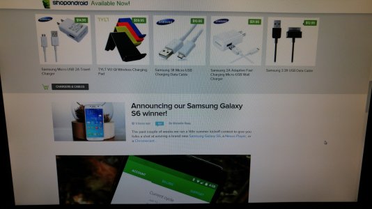
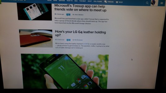
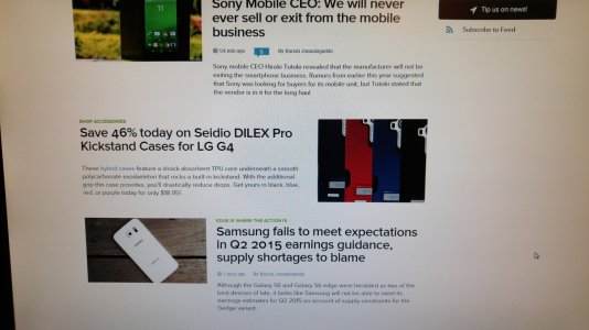
Edited to add: Like right now; the page begins with an article with its media (photo) on the left). The title of the article is in large bold letters, but before that there's a green heading tied to the article almost like a subheading of sorts, perhaps? It says catchy/witty/clever things that sort of pertain to what the article is about. "In it for the long haul" is the one for the article on Sony's CEO stating they're never going to quit mobile. "Edge is where the action is" is the one discussing Samsung's earnings call, etc. What exactly are these? I guess they're okay, but they add to the confusion because it's hard for the eye to tell where exactly to look. The next article is an ad for shop android, which is fine. Then there is an article with the media (photo) on the right side (why is it switching sides?). Then, a slight scroll down and there is an article with its media preview being HUGE (the photo is significantly larger than the other photos in the other articles).

That was all sort of stream-of-consciousness, so I guess the TL;DR is:
- No consistency on the page at all; or at the very least, it doesn't seem consistent. (media previews are different sizes)
- The whole page gives off an overwhelming feeling of chaos/confusion/messy. (articles have titles but also subtitles?)
- The eye doesn't know exactly where to look. (article title? other article title? the text that tells me content type (article/forum post/ad))?
 
Last edited:
Everything is all over the place. It looks like an accident with coding; like there are forgotten closing tags in the code somewhere or something.!

Can you post a screenshot of what you see? Is it the blank space in the right column that makes it confusing?

Screen Shot 2015-07-07 at 1.35.58 AM.jpg
 
Can you post a screenshot of what you see? Is it the blank space in the right column that makes it confusing?

View attachment 185393

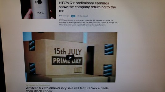
I agree the parts of the page that are streamlined look much better (like the screenshot you posted). The blank space on the right is okay, I don't think it's what makes it confusing to me. I find the different sized photos, extra titles, and the amount of different types of content thrown in the confusing part. I think you're on the right track with the removal of the forums posts to combat the confusion and the messy feel. I think we should somehow force the media previews to all the same size, and keep them in the same spots. Like I said, the streamlined parts of article on top of article with the media the same size and in the same position are looking good and don't have the confusion like before.

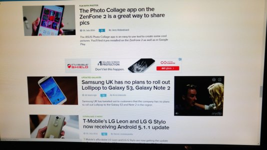
Here are some pictures I took.

20150707_015747.jpg
20150707_015814 2.jpg20150707_015917 3.jpg20150707_015832 4.jpg
 
20150707_023039 5.jpg

I think the improvements made so far are already showing you're on the right track. :-)
 

Forum statistics

Threads
954,377
Messages
6,961,475
Members
3,163,012
Latest member
FunkyCrunch