New front page redesign feedback!

I understand the need to monetize a website (as Phil would say "I get that") but this is just an awful design.

The picture I attached shows 3 different picture placements, 3 different picture sizes, and 3 different article starting points with seemingly no rhyme or reason why. The Shop Accessories article ( obviously a disguised advertisement) is always the second article no matter what happens.

If your goal was to create a complete clusterF@#! so that people would haphazardly click on ads then I think you have succeeded. There has to be a happy medium where you can get increased ad revenue without cannibalizing good design.

I really enjoy AndroidCentral and hope you guys fix this with something that is visually appealing. As others have said, I dread clicking on that AC bookmark right now because of this horrible front page design.
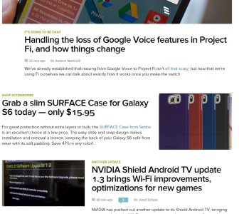

21.JPG
 
Seriously the new change is even worse. Now there are page-wide "banners" after some scrolling, giant forum post links...it's so terrible. The site looked great about 2 months ago, it's been getting worse with every iteration. Just change it back to how it was around June - smaller versions of the image-backed article links at the top, but let it scroll "infinitely" like it has for a little while now.
 
Updated again and looking worse again. Dual column layout looks cluttered.

Completely agree! Cluttered is an understatement! :( It's even worse on a mobile device (ex. Note 4).

Seriously the new change is even worse. Now there are page-wide "banners" after some scrolling, giant forum post links...it's so terrible. The site looked great about 2 months ago, it's been getting worse with every iteration. Just change it back to how it was around June - smaller versions of the image-backed article links at the top, but let it scroll "infinitely" like it has for a little while now.

Agreed! Site (blog and forums) is getting worse and worse with all these changes. Please make it stop! I'm already on the verge of ditching this site due to ongoing issues with its hide/unhide header (detailed in this thread: http://forums.androidcentral.com/an...lp/398682-new-header-layout-regression-4.html). The more things change the more I feel alienated from what used to be a great and useful site! :(
 
This is what it looks like on a 1600x900 display - full screen, no zoom. It's starting to look like a placeholder site, or one that appears when you mistype a URL and it's trying to trick into thinking it's what you're looking for.

06vvHav.jpg
 
It's about time for me to get my news in another fashion. This hot mess of a front page redesign along with the time it takes to load and reload the site is simply pathetic. Different sized images for the articles, different colored headers on some articles (other articles didn't have headers), and don't get me started browsing the forums in a mobile browser, that's a complete disaster. Every step this site takes is 4 steps backward, you had a better site 3 years ago.

Posted via the Android Central App
 
if i pick recent, why does it not remember?

It seems to remember for me after I select it and either refresh the page or close it and re-open it. But I agree otherwise, "Recent" should be the default anyway! It's the closest to the normal setup that displays all articles in chronological order. Otherwise I just don't understand this jumbled mess in how it's currently setup. :confused: I guess they're trying out new stuff by tweaking things. In either case, I agree with the sentiment above that the site was better a few years ago! Much more concise, logical and easier to navigate. Otherwise this new design feels like Lollipop; over-engineered change just for the sake of change. :(
 
Last edited:
As you've probably noticed, we've tweaked the front page again. OK, much more than a tweak. And while it's still a work in progress, it's also fewer ads. Faster load times.

But we want your feedback. So please leave your feedback here! Don't be shy. Don't worry about our feelings. (Because believe me, we have feelings about things, too. :p)

And as always, thanks!

It seems to be loading slower on my chromebook since all the updates.
 
I love Android Central but the website redesign is horrendous. I don't even view the website and instead just use the app because of how bad it is. Please bring back the old design where all the posts are "stacked". It is a lot easier to view the website that way.

Posted via the Android Central App
 
I agree with the others that the "Recents" view which grants stacked should be the default view. But, man...I also whole-heartedly agree that the website looked 1000x better years ago. I like trying new things, too, but the product we're using right now is god-awful.

You have users completely avoiding your website now and dreading clicking their AC bookmark. The app is all we have left. Is this really the goal here?
This isn't just me; look at the responses in not only this thread, but the other one or two as well.

Personally, I'm fine with how other areas of the site look (forums, etc). But the front page...good lord, the front page...it's not functional. :-/
 
@Jonneh - If you can give us specific examples or issues that make the homepage non-functional for you, that'd be extremely helpful. Thanks!
 
Android Central was once the only site I'd bother to visit for the latest news but honestly this sites current condition is forcing me to check out other options much more often. The only reason I even bother visiting at all anymore our the forums and it's great user base, full of helpful fans of Android. The forum members are your bread & butter guys and you really should make a real effort to please them because I have news for you, the forum is laggy too and it's only a matter of time before your users moves on, unless some improvements are made.

It's been 2 months since Phil asked for feedback on the redesign, the response was quick from users voicing their concerns but it certainly hasn't seemed to improve the site at all. The only way I've been able to even stand the news portion of the site is to read from the mobile address. The Mobile Option You may want to start there with the redesign of your redesign. ;)

My advise...
SITE REDISIGN
Go back to the old site design where you'd cycle through the news in a single column. Give the site pages again, where you get to the bottom of the page then move to the next, and bring back the page numbers at the bottom of the page. The run-on page needs to go, where you get to the bottom of the page and it loads more, then again, then again.
ADS
For crying out loud get rid of at least some of the freaking ads! I know you've got to make a living but at some point the ads are pushing users away and less ads will bring them back. Would you rather have 1,000,000 users looking at 1 ad or 100 users looking at 10 ads? I'd have to think you'd make just as much in revenue either way and the first option would make us both happy. And for crying out loud get rid of the video ads! I hate them and I hate that they play just a bit of audio before the realize that they shouldn't be and shut the audio off. A site based of the written word should have written ads or pictures, leave the video ads for Hulu or YouTube.

Your move! ;)
 
I have noticed a lot of the regular posters in the forums are no longer there. They have left due to this site. One good example is the M9 forum. Dead as a door knob.
 
i'm feeling I'm going to echo some of my other newsreaders here by saying I'm not a huge fan of the new redesign. I have waited for a few months since it happened to see if it would grow on me, and while parts of it are nice, other parts, not so much.

What I like:

Page definitely loads faster than it did before for me. I can usually get it up and start browsing within seconds of turning on my computer. Once i realized how to set it to Recent, i was good on the format. That doesn't bother me too much. I also like the layout on the headers, it flows nicely i think.

Cons:

The inline latest discussion thing is really annoying for me. I tend to use this site as a catch up on News articles, the same way I used to use Facebook (Still a Most Recent User here and refuse to buy into Top Stories), and it feels you went the Facebook method. I scroll until i see an article or a tagline i already read and stop. This then gets confusing to me with the discussions because the same discussions keep coming up as "Hot Discussion" or "Latest Discussion" and honestly, if I don't have the device i don't give a damn about what they're talking about in the G4 forums.

If you get rid of that and set Recent as the defaults instead of the Most Viewed or which ever setting it is now, I really think you guys will be back to having the same killer site you always had. Give this is just one mans opinion, so take it as you will. Otherwise I do enjoy the flow of the new site and think you guys are on the right track.
 

Forum statistics

Threads
955,708
Messages
6,965,562
Members
3,163,365
Latest member
msdonna