Separate Notification and Quick Settings panels is terrible

JFeisty

Active member
Nov 10, 2009
43
2
8
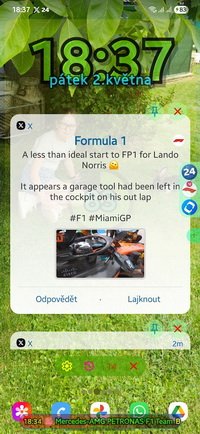
Separating the Notification and Quick Settings panels was one of the features Samsung should have absolutely NOT copied from Apple. It's always annoyed me whenever I've had to use my wife's iPhone and now Samsung is making it the default going forward?? It's just not something you should have to think about -- "Hmmm, which side of the screen do I need to swipe down from? Oops, I swiped 6 pixels too far to the right and now I can't see what I wanted!" Just silly in my opinion.

At least we can change it back to the normal, more logical way of getting the information we want. I just hope the option to change it back doesn't ever go away. Samsung, if you're listening, you didn't do the right thing here, IMO.
Totally agree with you. It’s such a small UI change but ends up being a big annoyance in daily use. Swiping down should be intuitive, not something that requires precision or remembering “which side does what.” Glad there's still an option to switch it back, but yeah, fingers crossed they don’t remove that in a future update.
 
  • Like
Reactions: JFeisty
Separating the Notification and Quick Settings panels was one of the features Samsung should have absolutely NOT copied from Apple. It's always annoyed me whenever I've had to use my wife's iPhone and now Samsung is making it the default going forward?? It's just not something you should have to think about -- "Hmmm, which side of the screen do I need to swipe down from? Oops, I swiped 6 pixels too far to the right and now I can't see what I wanted!" Just silly in my opinion.

At least we can change it back to the normal, more logical way of getting the information we want. I just hope the option to change it back doesn't ever go away. Samsung, if you're listening, you didn't do the right thing here, IMO.
I did find the new ui7 update has made the notifications much more organized. Same with the outer screen. UI7 has also organized BT devices in use. So for me I'd say the way notifications are now handled and def much more organized.
 
I've actually been trying to use it...to get used to it. But I just can't. It just doesn't make sense to me. I really don't want to have to think about where to swipe. I tried. Honestly! lol
 
I've actually been trying to use it...to get used to it. But I just can't. It just doesn't make sense to me. I really don't want to have to think about where to swipe. I tried. Honestly! lol
I've yet to see an explanation anywhere as to why the separate notification/quick panel shade makes any sense at all. What purpose is it supposed to serve? Keep your fingers/hand more limber?
 
  • Like
Reactions: Laura Knotek