Seriously considering Samsung 10 x+ when it comes out

I have to find the article awhile back, but full gesture meaning swipe like iphones .

No not pill, the search bar it's a pixel launcher trademark that you can't change.


Gotcha. I didn't mean the search bar. That's fine. I'm talking about the navigation bar (where the pill and back button currently sit). With gestures, you would think that space would go away and be given back to usable screen (ala OnePlus, Motorola, iOS...).

I believe Android Q's gestures will keep tap to go home and long press to launch Assistant. The only tapping they're removing is the back button. It's still early, but that's what the Q previews have shown so far.

I agree for the pill and back button take space , as even Samsung new UI is now gesture and pretty good .

Can't wait to beta test Android Q see what's in store .
 
I'm ready, too.

Besides hardware improvements, I sincerely hope Google fixes the gestures, too. There's no two ways about it: Android gestures are broken -- a half-baked, gobbled-together mess. We've all gotten used to them because we have no choice, but Google can do better here. It's worrisome that the Android Q previews show Google may still not get rid of the nav bar space for more usable screen. Just makes no sense...

I never had an issue with the gestures. I'm not suggesting there isn't room for approvements. I'm sure we will see improvments in Q
 
I never had an issue with the gestures. I'm not suggesting there isn't room for approvements. I'm sure we will see improvments in Q

I wouldn't say I have problems with them either. I mean, they're usable and I've gotten used to them.

I just don't believe Google needed an additional year to see that the gestures weren't right. Early beta testing during Android P should have given them all the feedback they needed. When P became official, reviews nearly across the board also criticized them for the poor implementation of "gestures."

If that happens again with Q, it'll mean the current iteration of gestures isn't changing very much either besides removing the back button.

Does Google really need another year to realize they should give the nav-bar area back to usable screen space? I sincerely hope not.
 
You clearly have no idea what you are talking about - Oxygen OS is not chunky nor do they have bloatware. One Plus has a great track record of updating their OS as well.

HOWEVER, I did notice Google dropped the price of the Pixel's yet again. $599 for baby pixel 3 is a really good deal right now. And I guess if you love notch, $699 for the XL...
Sure. Get back to me in three years about how great the updates are. That is, if you haven't already sold it by then.
 
I wouldn't say I have problems with them either. I mean, they're usable and I've gotten used to them.

I just don't believe Google needed an additional year to see that the gestures weren't right. Early beta testing during Android P should have given them all the feedback they needed. When P became official, reviews nearly across the board also criticized them for the poor implementation of "gestures."

If that happens again with Q, it'll mean the current iteration of gestures isn't changing very much either besides removing the back button.

Does Google really need another year to realize they should give the nav-bar area back to usable screen space? I sincerely hope not.

I guess we will wait and see. I get the impression that they pay less attention to forums and reviews then they do their research panels and surveys.
 
Which is exactly why "value", "support" and "quality" are foreign concepts to any company in the discount flagship business.

I am sorry but I still disagree and not sure why you think that about One Plus phones. Value? Check. Support? Well...I have never had an issue with them but plenty of people have so I guess you can have that one. Quality? Definitely a check. One Plus phones are made really well and do not feel cheap at all.

I don't know why I am defending One Plus phones in this topic though so this will be it for me about it here.
 
Pixel 3 and 3 XL are discounted by $200 dollars now. Assuming this is in light of the S10 announcement.

I reiterate my hopes that competition from Samsung will force Google to step it up with the Pixel 4 models. The Pixel 3 models corrected many of the things the Pixel 2 models got wrong. Great. Now Google needs to elevate the Pixel brand.
Greedy Google hasn't discounted **** on their UK store.
 
So we've gotten way off topic here, so let's turn back on course ..

The S10 lineup is a beautiful. I think Samsung did a great job with this year's offering, though their designs aren't my taste. I prefer a bit more restraint than what they offer. I don't use One UI, but the videos I've seen of it just seem like a questionable design philosophy.

Like I can completely understand Android P on a Pixel, but certain things about the approach to One UI seem conflicting or underutilized (so much empty space) to me. They make beautiful hardware, though.

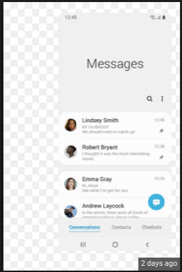
It's not empty space it gives you ability to scroll with your thumb for one hand operation and see most recent information then scroll up for older , it's a very very good layout if you can use it .
It's all about easier one hand use with larger display and they put all settings icon on bottom like phone dialer it has contacts dialer on bottom half of the screen so you dont have to reach all the way up.

Yeah, I get the concept and the idea why bring things to the bottom, but why do they leave so much space? Surely there's something useful that go in the to 40% of the screen besides a heading, right?.. I mean, put the weather there .. A stock quote .. anything.

To me that's just saying you've made phones either too tall OR your UI approach is busted somewhere.

Like Below. That's a lot of room for a heading, no?
 

Attachments

  • Screenshot 2019-02-22 at 2.35.11 PM.png
    Screenshot 2019-02-22 at 2.35.11 PM.png
    29.7 KB · Views: 20
Yeah, I get the concept and the idea why bring things to the bottom, but why do they leave so much space? Surely there's something useful that go in the to 40% of the screen besides a heading, right?.. I mean, put the weather there .. A stock quote .. anything.

To me that's just saying you've made phones either too tall OR your UI approach is busted somewhere.

Like Below. That's a lot of room for a heading, no?

It gives you unread count also
It's like apples reachability when it drops it leaves very empty page on top with nothing.

Can they improve it yes , add other things definitely but as of now it's that way but still very useful and I'm sure it will get better .


Edit: also you get the most important first 5 message then use the same thumb and scroll up for older ones and still with same thumb make a new message to someone.

Okay I got you. I watched the One UI video on The Verge, with Dieter bouncing around like a Jack Russell, so I have zero real working knowledge. I think it looks like a great UI, definitely better than where they were at before, just a bit confusing to my taste. But that's okay, I don't need to be the one that "gets it", since I'm not their customer right now.
 
Okay I got you. I watched the One UI video on The Verge, with Dieter bouncing around like a Jack Russell, so I have zero real working knowledge. I think it looks like a great UI, definitely better than where they were at before, just a bit confusing to my taste. But that's okay, I don't need to be the one that "gets it", since I'm not their customer right now.

I know Samsung not your taste , and you respect what manufacturers are out there. If one day you get a chance at being in a carrier store or bestbuy take a quick look at one Samsung phone let me know what you think...they come a long way definitely and probably get there soon as one best skins on andriod but still fall short.
 
I know Samsung not your taste , and you respect what manufacturers are out there. If one day you get a chance at being in a carrier store or bestbuy take a quick look at one Samsung phone let me know what you think...they come a long way definitely and probably get there soon as one best skins on andriod but still fall short.

I think I'll swing through BB this weekend and do just, that matter of fact!
 
Yeah, I get the concept and the idea why bring things to the bottom, but why do they leave so much space? Surely there's something useful that go in the to 40% of the screen besides a heading, right?.. I mean, put the weather there .. A stock quote .. anything.

To me that's just saying you've made phones either too tall OR your UI approach is busted somewhere.

Like Below. That's a lot of room for a heading, no?

And yet we complain about Samsung over adding things. No wonder they can be so schizophrenic with their UI 😂
 
And yet we complain about Samsung over adding things. No wonder they can be so schizophrenic with their UI 😂

I mean, I'm all for Samsung being what their people need for them to be. But even now, I was checking a couple of vids, and it's STILL too much going on for my taste. Docs/tabs/apps coming from the sides, the new interface all types of settings... Sheesh. Need to keep a note card handy for reference.:confused::p
 
I mean, I'm all for Samsung being what their people need for them to be. But even now, I was checking a couple of vids, and it's STILL too much going on for my taste. Docs/tabs/apps coming from the sides, the new interface all types of settings... Sheesh. Need to keep a note card handy for reference.:confused::p

Lmfaoo...
 

Forum statistics

Threads
954,292
Messages
6,961,216
Members
3,162,984
Latest member
qxill