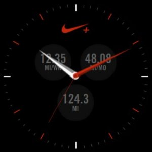
Thanks. This is a pretty good face, if only because it offers so many different kinds of info on the screen. Unfortunately, that's also a drawback unless you have the eyes of a hawk!
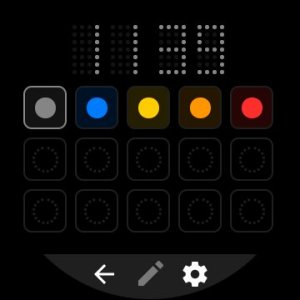
The size and color of the date make it next to impossible to see. I'd also like to see it possible to just leave off the app launcher complications if they're not needed. I really don't need instant access to three different apps.
The weather service that is used in the companion app is not accurate, at least for my location. The watch says it's 54F here, and it's actually 35F. It is, however, supposed to warm up later today so the watch face may just be displaying projected highs and lows for the day, rather than hourly updates.
I would say the overall design is just OK, but that's just me. Main problem is it's too busy with all the information, and that makes it hard to read.
What I'm most encouraged by is knowing more about what the possibilities are, and that more designers are actually getting on board with the watch.


 Automatically Displaying the Caller on My Pixel 7
 Twitter