Get rid of "material design" before being too late

Here are some fixable issues:

- Menus: just lists of words, you need to read all entries to get to the right one. http://www.androidcentral.com/sites...es/2014/08/ChromeBandwidth2.jpg?itok=2lPF6yj0 Some color icons may create some visual patterns for an easier access.
- Buttons (round ones especially): they are easily mistaken for labels, smaller shadow at constant distance may create some kind of "pushable" effect, like here: http://www.androidheadlines.com/wp-content/uploads/2014/07/material-design-prominent.jpg
- In some apps, the default icons color (grey) is too similar to "disabled" buttons in other OS.
- The clickable texts (like button links) are often mistaken for normal text, no difference.
- "Lollipop" colors for KitKat users are too sudden, try a smoother transition, at least remove the neon and red from until the full look is ready.
 
Last edited:
icon size, shape, and design is inconsistent. look at Contacts, Calendar, and Messenger vs. Chrome and Gmail. i like consistency.
 
I dunno, I kinda appreciate the Material Design compared to Holo. It's one of the reasons why I can take Android as it is compared to BB10's more elegant UI. Now that Lolipop got out, i find the minimalistic UI very pleasing to the eyes and I can put it side by side with the BB10's UI. I also see the distinct characterstics between the two as well; Android being the play side of things and BB10 being the work side of things.
 
Last edited:
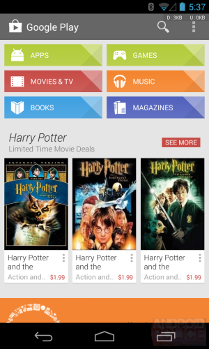
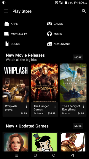
I like the new look, with some exceptions. For an LCD screen, it looks so much cleaner. Take that however you'd like, but clean is sexy on a smartphone (to me). Below are some comparisons from the old Play Store under Ice Cream Sandwich to the new Play Store under Lollipop.

Which do you prefer?
 

Attachments

  • google play old.png
    google play old.png
    756 KB · Views: 33
  • google play new.png
    google play new.png
    700 KB · Views: 33
I like the new look, with some exceptions. For an LCD screen, it looks so much cleaner. Take that however you'd like, but clean is sexy on a smartphone (to me). Below are some comparisons from the old Play Store under Ice Cream Sandwich to the new Play Store under Lollipop.

Which do you prefer?

Am I correct that the first image is Play Store under IC and the second image is Play Store under Lollipop? The reason I ask is my Play Store looks like the first image, but I am running Lollipop.
 
Am I correct that the first image is Play Store under IC and the second image is Play Store under Lollipop? The reason I ask is my Play Store looks like the first image, but I am running Lollipop.

Yes, but that's not the stock play store and/or a stock ROM unless it is using xposed or something similar.
 
Am I correct that the first image is Play Store under IC and the second image is Play Store under Lollipop? The reason I ask is my Play Store looks like the first image, but I am running Lollipop.
Yes, although your Play Store is different looking still, with bolder colors and cleaner with less gradient. But my screen was to emphasize the material flatness.
Yes, but that's not the stock play store and/or a stock ROM unless it is using xposed or something similar.
Correct, it's DirtyUnicorns ROM with black-out Play Store.
 
I like the new look, with some exceptions. For an LCD screen, it looks so much cleaner. Take that however you'd like, but clean is sexy on a smartphone (to me). Below are some comparisons from the old Play Store under Ice Cream Sandwich to the new Play Store under Lollipop.
Which do you prefer?

Xocomaox, what you think about Tokyo Hotel?
 
I'm in the camp that hates material design, even after using it now for a while. The worst part is that I can't just revert to kitkat easily, apparently. I feel like this is just some random new skin I'm trying, like trying out different themes in Windows - most of them you probably won't like. But at least there you just go and switch back to your original or whichever other one as you please; not the case here, which is pretty ridiculous.
 
Re: Get rid of "material design" before being too late

I'm starting to like material design, especially after switching to dark theme.

68e8ec1c3c628136e04768e2a295ce9d.jpg


80efb68e5becdbeaf97eeac42522c0b1.jpg


Sent from my G2 running CM 12
 
Re: Get rid of "material design" before being too late

Is your phone rooted? When did a dark theme for Lollipop become available?
Yeah, I'm rooted and running a custom ROM (CyanogenMod) which has a bunch of themes. You can mix fonts, boot animation, style, etc. from different themes.

Sent from my G2 running CM 12
 
I agree with dan, sorry, but I think the material design is really nice looking.
It's ok that you don't like it. You don't Have to upgrade to 5.0, you can keep on rockin 4.4 as long as you want.
Never thought android devices taking months and/or years to get an OS update as a feature, but there You go.

Yes, you are forced to take Material Design. When they stop releasing updates for apps on 4, when your phone falls in the toilet and you have to get a new one that comes with 5 preinstalled, when the rest of the world moves beyond. I was on iphone and most happy with ios5. They started ruining stuff with ios6 but 7 was where they finally crossed the line. I made the jump to android just before they started drinking the same poisoned kool-aid. This flat crap is ugly as sin.
 
Yes, you are forced to take Material Design. When they stop releasing updates for apps on 4, when your phone falls in the toilet and you have to get a new one that comes with 5 preinstalled, when the rest of the world moves beyond. I was on iphone and most happy with ios5. They started ruining stuff with ios6 but 7 was where they finally crossed the line. I made the jump to android just before they started drinking the same poisoned kool-aid. This flat crap is ugly as sin.

the throw on a launcher and hide whatever it is you don't like.
Geez, this was from like 6 MONTHS ago. Get over it. android released 5.0 6 months ago and android is a CHOICE YOU made.
iOS and Blackberry and Windows phones are other options.
OR, you could have just chosen a device that didn't have 5.0 pre installed. Which means, you can avoid the nexus 6 and the Galaxy S6. ... that's about it. and it's ugly in YOUR opinion. I have the S6 and think 5.0 is flippin awesome looking.
and since 98% of devices are still running 4.4.4 or lower, you can't say that everyone is updating their apps to ONLY work on 5.0 because that is complete BS.
 
I don't like how it looks either, when I started using it my eyes were bleeding I think. But my android(nexus 5) is just a phone they gave me at work... I just leave it in my tool bag. Has everyone seen the new Acrobat DC (new adobe reader) on Windows desktop? They're starting to go to a similar style. It's everywhere, so get used to it on popular OS's.
 
Re: Get rid of "material design" before being too late

However I'm using office 365 which is actually the first office I like since 2010, that being said material design for a desktop is stupid. The point of MD is it's supposed to be good for smaller screens.... Anyways, saying you have a choice when everyone is copying it, is kind of disingenuous.
 
I'm not loving the Material Design choices at all. 4.4.4 looked lots better, and I wish I could add that design onto my 5.0.2 from AT&T.
 

Trending Posts

Forum statistics

Threads
954,943
Messages
6,963,264
Members
3,163,160
Latest member
primewealth