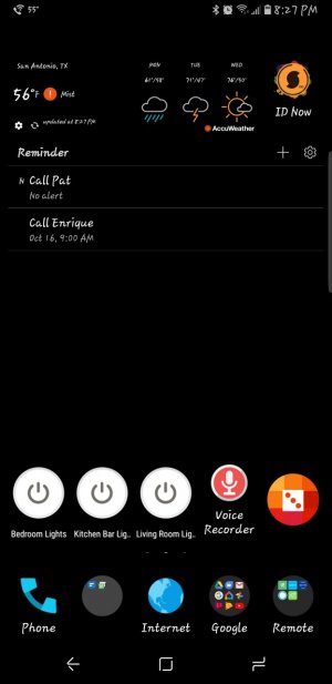
Has anyone else noticed about a half inch gap between the top row of icons on the home screen and the status bar? I know the top row used to be so close to the status bar, certain widgets would appear against the status bar leaving no gap. I think this is a huge waste of screen real estate, this gap is big enough to snugly fit a search bar (see photo)
Home screen icons moved down? Noticable gap between status bar & top row of icons
- Thread starter ArykMeyer
- Start date

Similar threads
Trending Posts
-

-
-
-
Incoming calls problem when on tiktok
- Started by camran
- Replies: 2
-
 Twitter