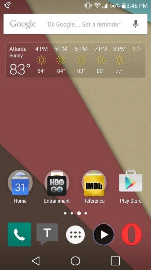
I have to say, for stock that's pretty nice looking.
It also clearly illustrates in your dock icons one of my biggest aesthtic beefs with Android. Look at those icons. They're all mismatched. You have a square phone icon, a cutout Textra icon, a round media player icon and Opera(?) as just a standalone letter. You can see it in the visible icons on your weather widget page, too. That's terrible design. Looks juvenile and half-...hearted. No third party icon pack is perfect, but many of them are better than stock.
")


 What’s the One Android Feature You Can’t Live Without?


 Twitter