- Feb 6, 2017
- 99,086
- 15,793
- 113

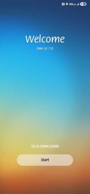
Samsung’s stable One UI 7 update reportedly rolling out for Galaxy S23
Samsung is slowly rolling out the release, at least in some places
So far. I'm not liking the new interface. Looks too much like an iPhone to me!
HelloHi mustang7757, S23 sounds nice, but have you tried the [Mod Redacted]
It has this features:
Enhance Every Photo: Capture great images and refine them effortlessly using Photo Assist¹ with Galaxy AI.² Easily adjust, move, or remove objects for polished results.
Seamless Communication: Break language barriers with real-time translation¹ for text, calls, and conversations—powered by Galaxy AI.²
Instant Slow Motion: Relive key moments with Instant Slow-Mo¹. Simply tap and hold any video for smooth, slow-motion playback.
Long-Lasting Battery Life: The Galaxy S24 FE intelligently manages app usage to extend battery life for work and play.⁴
Optimized Low-Light Photography: Night Portrait, enhanced by Galaxy AI,² brings clarity and detail to photos taken in dim lighting.
I think I want to have discussions with you about our Samsung Phones.
Looking forward hearing you.
Regards,
V

How?I haven't had a chance to play with it much when I downloaded it traveling and busy today but a few comments from using it...
I don't like the weather widget anymore. I don't like how it displays info looks weird if too small like a pill and at various sizes there is just to much blank space. So I removed it. I'll just look outside my window to check weather.
Don't like the pull down for notification and then separate pulldown for quick panel. Fortunately you can change it to the previous pull down to TOGETHER for both and pull further for quick panel.
The brightness slider in quick panel... do we really need a non-removeable dark mode button to the right of it??
Actually looking at it further, I really do not like the quick panel...
For volume, why did they remove the ability to edit buttons and be able to put a dedicated mute button??
I used that mute button all the time when i just need to swipe down and hit mute.
Now I have to zero in on the volume slider and hit the mute button to the right and I've mistakenly hit the dark mode button a couple of times already.
Note: I just realized changing the panel pull down to TOGETHER does bring the old line of buttons back on the top including the mute button. Still don't like having a non-removeable volume slider and so close to the brightness slider.
And why a non-removeable volume slider?? Isn't that what the volume buttons on the side are for??
They let you remove the Device Control and Media Output buttons when you swipe down... but they dont let you remove the four options at the bottom of the panel... Nearby Devices, Home, Smart View and Modes from the panel??
It really is like iOS now... you really can't customize like you want otherwise I'd be able to change all of the above.
I'll get use to it but it's a lame upgrade.
Don't like the pull down for notification and then separate pulldown for quick panel. Fortunately you can change it to the previous pull down to TOGETHER for both and pull further for quick panel.
How?.
If I could I would kiss you right now! Thank you soooooo much for these instructions!
What she said!If I could I would kiss you right now! Thank you soooooo much for these instructions!


 Twitter