New Forum Design: Official Feedback Thread

I'm going to drop out for awhile and maybe return if the AC 2012 works again. Can't stand this Mona style. It's more difficult to read, with no flow. It takes longer to scroll the page because the thread separation is wider (for no good reason!), the number of replys on the left side is distracting and now forces me to look in two places for replies and number of reads. No info on where the thread was started, or number of pages. No flow!

It's different, but NOT better! It's really too bad the devs have no idea what makes things work... makes things "easy"! I can't believe they can't make this site "look" new without removing functionality and flow. If I didn't know better, I'd think these designers worked for Google!

I have mentioned that the font is pretty big. I have been advised they are working on a more.. How do you say.. "zoomed out" version. This way the font won't be so big on some monitors (like on mine at home).
 
I have mentioned that the font is pretty big. I have been advised they are working on a more.. How do you say.. "zoomed out" version. This way the font won't be so big on some monitors (like on mine at home).
I heard they were doing a lot of cosmetic stuff once the functionality is nailed down.
 
Don't like it so far--too spread out with tons of wasted space. I don't want to have to scroll endlessly to skim a lot.
 
:cool: Can Sammy hammer a Nail on the new design-Yes be gentle!

Well to be short I agree with all the above commentators the

Layout is too blurry and in a word difficult to access

our usual Threads posts-PM-etc. Yeah we wanted

changes here they're: Let's suggest ways to

improved the new AC-GUI : stay Tuned!


Forgot: Just sent this post Now I see
all the icons around Blurry hard to read
Make visible the likes given-Aren't shown
 
Last edited:
Looks like something has changed but not sure what? Looks good though. Colour change?
Also, thanks very much for fixing the large cursor problem and the links at the top of each post.. Looks much better now.
.
Screen Shot 2017-02-28 at 12.49.25 PM.png
 
It will take some getting used to but it does look cleaner. Do you plan to put the top posters and most likes back at the top?
 
It will take some getting used to but it does look cleaner. Do you plan to put the top posters and most likes back at the top?

I'd like having that feature back too, was cool to recognize people who are highly active.
 
How about the ability to actually use the drop down picker for which style we want? What's the point of having that if it doesn't actually work?

Why is the goal of these changes always to "dumb it down" and make things less useful with less available info. Space for more ads?
 
Why is the goal of these changes always to "dumb it down" and make things less useful with less available info.

I don't think that is the goal. A cleaner interface that holds up to modern design standards and is attractive to new users was more likely the goal.
I agree with your first statement, the drop down to choose styles should be removed unless it is intended to work. I'd vote for remove it rather than make it functional.
 
Today I find some features have been brought back.
More scrolling is required to get to a thread.
I find the appearance a bit of a strain on my eyes .
 
I don't think that is the goal. A cleaner interface that holds up to modern design standards and is attractive to new users was more likely the goal.
I agree with your first statement, the drop down to choose styles should be removed unless it is intended to work. I'd vote for remove it rather than make it functional.

Wouldn't new users nowadays be much more tech savvy than new users from back in the day? Why do these new users need an interface with less info and functionality?
 
Wouldn't new users nowadays be much more tech savvy than new users from back in the day? Why do these new users need an interface with less info and functionality?

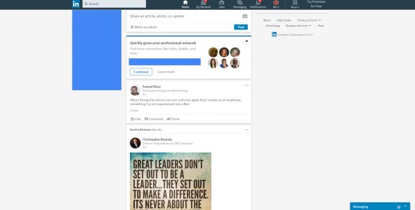
As I said, I don't think less info and functionality is the goal. I think that a cleaner interface that holds up to modern design standards and is attractive to new users was more likely the goal. I also think this UI is intended to be able to more easily scale to mobile, desktop and other environments. As a counter example, here is LinkedIn's new UI:

linkedin.jpg

They're going after the same goal, but failing a little bit because they're only using about 30% of the display area for content. Probably looks great on mobile, not sure.
 
As I said, I don't think less info and functionality is the goal. I think that a cleaner interface that holds up to modern design standards and is attractive to new users was more likely the goal. I also think this UI is intended to be able to more easily scale to mobile, desktop and other environments. As a counter example, here is LinkedIn's new UI:

View attachment 253234

They're going after the same goal, but failing a little bit because they're only using about 30% of the display area for content. Probably looks great on mobile, not sure.

So LinkedIn has basically copied Facebook. Is that the goal here? To make it like Facebook?
 
So LinkedIn has basically copied Facebook. Is that the goal here? To make it like Facebook?

No, those are examples of failing. LinkedIn was shown to highlight how much better the devs here are doing than Microsoft and now that you brought up Facebook, them as well.
 
I agree with your first statement, the drop down to choose styles should be removed unless it is intended to work. I'd vote for remove it rather than make it functional.

Perfect! Less choice + less function = innovation! The web designer's ethos, circa 2017.
 
Perfect! Less choice + less function = innovation! The web designer's ethos, circa 2017.

You'd rather spend money on fixing a pointless feature rather than just throwing it away and spending that money on improving other things?
 
You'd rather spend money on fixing a pointless feature rather than just throwing it away and spending that money on improving other things?

It probably wouldn't be a pointless feature if they had competent people working on it. IMHO:'(
 
Last edited:
YouTube does include a "run back" button when they do interface changes. I don't think they should, but they do. Maybe something like that would be better here than a menu to select one of half a dozen completely broken and two functional templates.
 
Found this post on AC's sister site Crackberry from their Mod Team Leader regarding the style chooser:

New Forum Design: Official Feedback Thread - Page 2 - BlackBerry Forums at CrackBerry.com

"02-26-17, 09:15 PM

right now there is no way to go a different skin. Tech is aware of that though so expect a fix.

Its mobile web and desktop web only no app changes were "made."

There are issues when clicking links from CB10, Tapatalk, Android apps to the open forum mobile view. These will need fixed still.

Thanks for feedback and we are trying to get to everything as fast as we can
"

That makes it sound like it's intended to work :) In that case, fix it! Oh, they already know.
 
Found this post on AC's sister site Crackberry from their Mod Team Leader regarding the style chooser:

New Forum Design: Official Feedback Thread - Page 2 - BlackBerry Forums at CrackBerry.com

"02-26-17, 09:15 PM

right now there is no way to go a different skin. Tech is aware of that though so expect a fix.

Its mobile web and desktop web only no app changes were "made."

There are issues when clicking links from CB10, Tapatalk, Android apps to the open forum mobile view. These will need fixed still.

Thanks for feedback and we are trying to get to everything as fast as we can
"

Yay! There's hope..........:D
 

Forum statistics

Threads
956,793
Messages
6,970,062
Members
3,163,626
Latest member
glastek16