- Aug 21, 2014
- 4,471
- 299
- 83
Just wanted to create a One UI 6.0 post just to say...
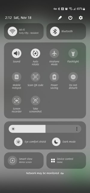
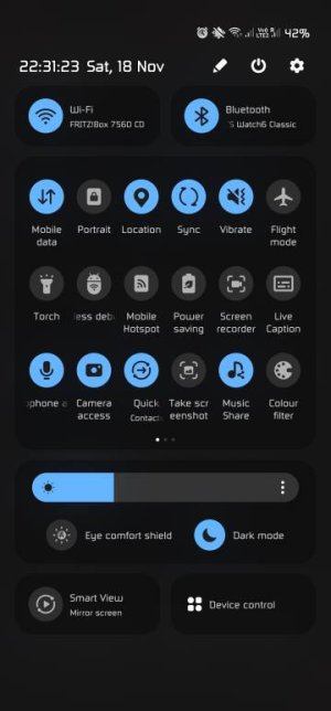
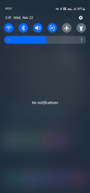
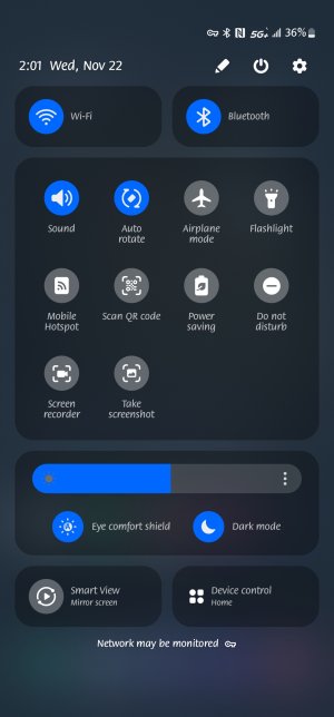
I wish they still kept the blue buttons when you enabled a switch like wifi or Bluetooth, etc.
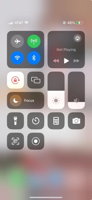
The while drop down is an iOS rip off that doesn't match the rest of Android 14. And even iOS uses blue buttons to show activated switches. Easier to see for a quick glance.
Buttons like Smart View and Device Control are useless to me and rather have the option to hide them instead of being there to accidentally press.
Other than that. Pretty much like the last two OS updates can't really see any other differences.
