- Sep 4, 2013
- 4,407
- 0
- 0
As the release of the LG G5 draws close, we have quite a lot of expectations. One of those is the software.
LG UX has come a pretty long way. It was once the ugly duckling in the world of phone software design, with ugly elements and poor choice of colors. It has improved since then, and even got a much-needed optimization boost in the G4, but it still ain't a looker. While it does work pretty well, the main gripe is that the default DPI of 640 is just too big. Everything feels cramped and don't really take advantage of all that screen real-estate. After using the Note 5 for some time, going back to the G4 felt rather cramped.
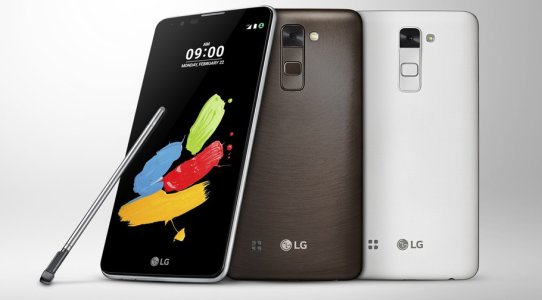
So why am I bringing this up? Take a look at the LG G Stylo 2. Look at the status bar up top.


It's a little hard to see, but you can faintly see the word "LTE" on top of the signal strength indicator. That's exactly how it looks like in stock Android. In fact, even the signal-strength bar indicator is exactly the one from stock Android. In LG UX 4.0, the data icon and the signal-strength indicators are different

So what does this mean? It is somewhat possible that LG may have scaled back further on LG UX, relying more on stock Android elements while adding their own touches, in a similar fashion to Sony on their stock and Concept firmware. Then again, these could just be placeholders, so as always, do take these with a grain of salt.
LG UX has come a pretty long way. It was once the ugly duckling in the world of phone software design, with ugly elements and poor choice of colors. It has improved since then, and even got a much-needed optimization boost in the G4, but it still ain't a looker. While it does work pretty well, the main gripe is that the default DPI of 640 is just too big. Everything feels cramped and don't really take advantage of all that screen real-estate. After using the Note 5 for some time, going back to the G4 felt rather cramped.
So why am I bringing this up? Take a look at the LG G Stylo 2. Look at the status bar up top.


It's a little hard to see, but you can faintly see the word "LTE" on top of the signal strength indicator. That's exactly how it looks like in stock Android. In fact, even the signal-strength bar indicator is exactly the one from stock Android. In LG UX 4.0, the data icon and the signal-strength indicators are different

So what does this mean? It is somewhat possible that LG may have scaled back further on LG UX, relying more on stock Android elements while adding their own touches, in a similar fashion to Sony on their stock and Concept firmware. Then again, these could just be placeholders, so as always, do take these with a grain of salt.

