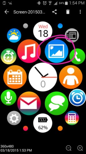
I know what your saying about it being simular to apple, but can we please keep apple out of this forum.
apologies I do understand what you're saying too but wrt to this specific thread about this specific watchface there is an elephant in the room (or to state that more precisely an elephant on your wrist)
so yeah no ill-informed biassed or irrelevant X vs Y opinions/comparisons that turn into fanboy flame-wars but said elephant is like going to become something of a benchmark despite the current "gold" standard being the Gear S
I really like the watch face and look forward to improvements (especially if they come out well before Apr 24!)
@mbm
I did comment in my 5star review i would have preferred a more readable clock until i realised doh thats why the clock icon is the way it is
I tried a WF with a digital time/date and like 20 app icons which was slightly more usable for my similar old eyes but less attractive and a bit dorkish
then I switched to always on + power saving (if that makes sense)
what shows on the screen (until I move my wrist) is an easily readable easily glance-able white on black digital clock
which also further mitigates against dorkishness in public life and enhances the value proposition of having a smartwatch - so one can always see the time (like a real watch)
...but move your arm and it turns into something else - in this case to use the preposition dropping vernacular of a certain non-android company "iW@tch Ultra"


