One UI: Great features. Terrible looking
- Thread starter sonnnet
- Start date
You are using an out of date browser. It may not display this or other websites correctly.
You should upgrade or use an alternative browser.
You should upgrade or use an alternative browser.
Yes, but this is also why there are launchers because not everyone likes the design choice of the OEM.This is why the "update" should not be mandatory.
Yes, looks a little different but acts the same. but I believe the maintenance edge panel is no longer available.Is the edge panel still active on Pie? If so does it look and act the same way as it does in Oreo?
TheGeekNextDoor
Well-known member
- Dec 22, 2010
- 132
- 0
- 0
When I saw the demos of the One UI, I hated it. I love the dark mode along with everyone else. I LOVE the gestures. I have a very thin case that doesn't come up much on the top and bottom, so I don't even feel the case there. My wife has an iPhone XS with the gestures, and we both love the way apple did the gestures there as well...if not better actually...apple just does transition animations way better than everyone else.
The buttons are a little cartoonish. I use Nova Prime with mine and love the features it brings like no margins on the widgets and the ability to double tap the desktop to launch an app of your choice...not to mention the ability to shove more into the bottom bar on the home screen.
The more I use it, the more I like it. I'm just happy they brought back the calendar of today's events back to the always on display.
Everyone knows that the look of the phone UI changes every year or so. It is a fact of life. As they chase apple, you are going to see more and more apple style interfaces. I have a OnePlus 6T as well. I find myself oddly attracted to using that phone. The biggest drawback for me with the OnePlus is the lack of wireless charging. The UI is amazing and fast.
The good news is that you can buy a new phone. The bad news is that Samsung phone values don't hold up at all like their apple counterparts.
chrism8922@gmail.com
Active member
- Jan 22, 2011
- 30
- 0
- 0
The good news is that you can buy a new phone. The bad news is that Samsung phone values don't hold up at all like their apple counterparts.
I just did buy a new phone. It's the Note 9. Now it doesn't work or look like it did, and I can't return it.
ROE_HUNTER
Well-known member
- Jan 13, 2016
- 721
- 29
- 28
I don't like the design or the theory behind it. I bought the correct size phone for my hands and my use, and there's nothing more usable about the very bottom of the screen than any other part. So now the design looks terrible and is harder for me to use one handed.
My biggest issue is that I bought the phone one way for $1000, and now it's not that way anymore, and I can't change it back. So I hate it.
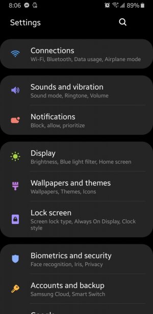
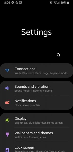
I agree with this... why can't there be a setting that doesn't allow it to do this? They have titles in the right spot.
So it stays as in the first pic, and doesn't let it go down like in the second pic.


DARK Vader777
Well-known member
- Feb 5, 2016
- 958
- 0
- 0
I like the New UI. Maybe when Goodlock gets updated so we can use it with Pie, we can customize it the way we want. I gave up on using other Launchers and Icon packs years ago.
As long as it Pie runs smoothly I'm good.
I had one bad hiccup a couple days ago and now everything is fine.
Thank goodness!
As long as it Pie runs smoothly I'm good.
I had one bad hiccup a couple days ago and now everything is fine.
Thank goodness!
skatergirl
Retired Moderator
- Mar 22, 2011
- 3,232
- 96
- 48
There is not even a chance I could ever use this phone in one hand.Example: in order to use the gestures at the bottom, my finger hits the case due to the slim bezels. It's inconvenient and feels weird, and requires both hands for me to get my thumb all the way down there.
I've never particularly needed to use my phone in only one hand, and I don't think this design makes it any easier if I did. That's why I bought the phone with the old UI - it worked and looked super clean.
I'm glad some people like it, but those people didn't buy my phone for me. I did, and suddenly everything changed and it's too late to return it (I tried).
JHBThree
Well-known member
- Feb 15, 2012
- 4,096
- 147
- 0
There is not even a chance I could ever use this phone in one hand.
Me either. It hurts my hand to do it. But the UI changes do help. Quick settings especially, but other little things too. Google needs to straight up copy Apple with the icons at the bottom for every app, and make it a mandatory design element. The phones have grown, but Google has done next to nothing to make Android work better on larger devices
JHBThree
Well-known member
- Feb 15, 2012
- 4,096
- 147
- 0
I just did buy a new phone. It's the Note 9. Now it doesn't work or look like it did, and I can't return it.
Such is life with big software updates. You'll adapt.
bandofbrothers2112
Trusted Member
- May 30, 2016
- 2,127
- 2
- 38
Night mode is what I wanted and to be fair there's always a theme or icon pack to skin over what you don't like.
I'd prefer to have the stacked option in multitasking instead of just the full cards and I'd like the dot back in my navigation bar but apart from that it's fine for me.
I'd prefer to have the stacked option in multitasking instead of just the full cards and I'd like the dot back in my navigation bar but apart from that it's fine for me.
Johnston212
Well-known member
- Nov 14, 2010
- 1,012
- 0
- 0
I too like the layout. The empty screen on the top helps to reach top of the screen. Once you move up it fills. Seems more practical.
I actually think that it is stupid and inefficient. Instead of being able to access what I need without having to go through any extra steps, I now have to scroll further and get stuck with a stupid Settings or Messages stamped in the top of the screen.
Johnston212
Well-known member
- Nov 14, 2010
- 1,012
- 0
- 0
I think it looks better than the old design as well. If you scroll up a little, it will fill the screen.
And this is more efficient than just showing the information that you need to begin with how?
Johnston212
Well-known member
- Nov 14, 2010
- 1,012
- 0
- 0
Night mode is what I wanted and to be fair there's always a theme or icon pack to skin over what you don't like.
I'd prefer to have the stacked option in multitasking instead of just the full cards and I'd like the dot back in my navigation bar but apart from that it's fine for me.
If night mode worked with themes, then I would agree.
- Feb 6, 2017
- 98,965
- 15,650
- 113
I actually think that it is stupid and inefficient. Instead of being able to access what I need without having to go through any extra steps, I now have to scroll further and get stuck with a stupid Settings or Messages stamped in the top of the screen.
How is it stupid ?
It gives you your first 5 or 6 messages , if want to look at older ones just scroll up all in one motion. At the top where it says messages it also gives any unread messages under it, I think it well thought out , also it has contacts at the bottom if you choose send a new message to someone all with just your thumb.
Johnston212
Well-known member
- Nov 14, 2010
- 1,012
- 0
- 0
There is not even a chance I could ever use this phone in one hand.
I have big hands and I don't use it with one hand either.
bassplayrguy
Trusted Member
- May 3, 2013
- 2,946
- 14
- 38
Nobody said it is more efficient. It serves both parties. Why complain? Don't like it, buy something else.
And this is more efficient than just showing the information that you need to begin with how?
bassplayrguy
Trusted Member
- May 3, 2013
- 2,946
- 14
- 38
Ppl will cry and complain about anything .
How is it stupid ?
It gives you your first 5 or 6 messages , if want to look at older ones just scroll up all in one motion. At the top where it says messages it also gives any unread messages under it, I think it well thought out , also it has contacts at the bottom if you choose send a new message to someone all with just your thumb.
Johnston212
Well-known member
- Nov 14, 2010
- 1,012
- 0
- 0
Nobody said it is more efficient. It serves both parties. Why complain? Don't like it, buy something else.
A little late for that. If more apps supported the theme store then I would simply replace it.
Similar threads
- Replies
- 32
- Views
- 62K
- Replies
- 12
- Views
- 9K
- Replies
- 269
- Views
- 30K
- Replies
- 39
- Views
- 8K
- Replies
- 32
- Views
- 6K
Trending Posts
-
Anyone try the new blood pressure function?
- Started by MotorMike2020
- Replies: 0
-
Cara Unlock Access Token BNI DIRECT Terkunci
- Started by BNI DIRECT12
- Replies: 0
-
-
Cara buka blokir Mobile Token access Terblokir
- Started by BNI DIRECT12
- Replies: 0
-
Question INFO BNI)- Unlock Access Token BNI DIRECT Terkunci
- Started by BNI DIRECT12
- Replies: 0
Members online
Total: 7,287 (members: 13, guests: 7,274)
Forum statistics

Space.com is part of Future plc, an international media group and leading digital publisher. Visit our corporate site.
© Future Publishing Limited Quay House, The Ambury, Bath BA1 1UA. All rights reserved. England and Wales company registration number 2008885.
