The new header layout is a regression

Thank you all for highlighting these issues. Yesterday and last night was spent bug fixing and tweaking so we really appreciate your patience.

Many of the issues mentioned here are now fixed. The work continues.

The struggle to launch it perfectly comes from us deciding to mix the old site with parts of what will be the new site. Long story short, we are mixing Responsive design with non-responsive and sometimes it causes a hickup.

Thank you. We appreciate your hard work :)
 
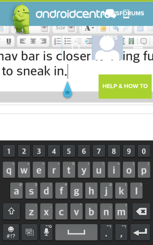
The nav bar is closer to being functional, but it still likes to sneak in. It does some really odd things the moment one zooms in. Like it had auto hidden itself just fine now when scrolling, but as soon as I tapped in a text box it put this over what I was typing.

Screenshot_2014-06-12-11-10-18.png

Also I figured out the file upload box. The more I zoom out the more centered it is in the screen, as I zoom in it goes down and to the right. The buttons are small and close together, so if I barely miss it will zoom in and teleport out of sight. Like the box is hard aligned in terms of absolute distance, so when it zooms in the alignment pushes it outside the page itself. Improving the button layout/size and or the positioning logic would solve this nicely.
 
It helped me finally figure wth a hamburger icon is. You Americans and food! What was wrong with three bars?
Full website on computer, or Tapatalk on the phone for me. It's mostly good, not too much wasted space up top. Yet to use it in earnest, but if it's a work in progress that's enough for me.
But I WILL go back to the website tonight and find something to quibble about.

Posted via Android Central App
 
The nav bar is closer to being functional, but it still likes to sneak in. It does some really odd things the moment one zooms in. Like it had auto hidden itself just fine now when scrolling, but as soon as I tapped in a text box it put this over what I was typing.

View attachment 123008

Also I figured out the file upload box. The more I zoom out the more centered it is in the screen, as I zoom in it goes down and to the right. The buttons are small and close together, so if I barely miss it will zoom in and teleport out of sight. Like the box is hard aligned in terms of absolute distance, so when it zooms in the alignment pushes it outside the page itself. Improving the button layout/size and or the positioning logic would solve this nicely.

Undocking the keyboard helped for me.

dpham00, Android Central Moderator
Sent from my Verizon Samsung Galaxy Note 3
 
Undocking the keyboard helped for me.

dpham00, Android Central Moderator
Sent from my Verizon Samsung Galaxy Note 3

Thanks I will try that later. Maybe it will be the excuse to buy a bluetooth keyboard

Still issues *reading PMs*, part of the text is covered by the adbar on the right and there is whitespace remaining to the right of that.
 
New layout looks fantastic, but does not work well on my iPad! I can not log on properly, and have to log on via the mobile page and then back door to the full HTML site. When I click on the login button under the new header on safari on my iPad it just hangs. I will have to try Safari on my MacBook Pro and see if it is a Safari issue. The new header works fine on my PCs. And yes I have also tried Chrome on my iPad and that too will not load the login page.

EDIT: Ok tried on the Mac, it worked, BUT it was slow, on the hand off to passport, slower than IE and Chrome on my PCs are at it, so that is where to look. :)
 
Last edited:
3. Too much blue and an odd shade of it. Feel like I'm swimming in water.
4. Featured stories area at the top is too big and the blue tint makes it look washed out
I agree - it's one big, unpleasant visual "blur" due to EVERYTHING having this same tint.
 
A couple days in and yeah the header lacks energy. Currently on my 7.0 LTE and the article bumps look as inviting as darkened alleys. All they do is slow down my loading and scrolling. I'd hate to be browsing on something slower like the 7.0 wifi, because the mobile site just doesn't serve well on screens over 5" in size.

I am also curious whether the new system is significantly increasing the page generation time on the server side, because I am still getting long-running-script warnings on PC desktop...that either means it's overwhelming the browser script engine or it is stuck waiting on unreceived data.

I think it LOOKS great, there are just some functional issues that need to be worked out, but the look is fantastic in my opinion!
 
I am reading the forums on a PC. I am finding the new look and function to be very annoying. The constant drop downs are very annoying. I wish you would give us an option to turn these drop downs off. I don't see any option.
 
Do you mean the dropdowns for 'forums' and 'shop'? Or the slideout from the right hand side of the page?
 
Don't know if it's been mentioned, but I can't save the desktop site as a bookmark on the stock browser of my Samsung Note 3 any more.
The mobile site always comes up, then I select desktop view in the menu and it will load.

Sent from my SM-N9005 using Tapatalk Pro
 
I'm talking about the drop downs not the sides. If I page down then it's ok. But as soon as I page up even a little bit the drop downs pop down. It's extremely annoying. And I notice today that these forums are even slower to load.
 
Don't know if it's been mentioned, but I can't save the desktop site as a bookmark on the stock browser of my Samsung Note 3 any more.
The mobile site always comes up, then I select desktop view in the menu and it will load.

Sent from my SM-N9005 using Tapatalk Pro

Thx for reporting. Have notified the tech team.
 
I'm talking about the drop downs not the sides. If I page down then it's ok. But as soon as I page up even a little bit the drop downs pop down. It's extremely annoying. And I notice today that these forums are even slower to load.

What OS/Browser are you using on your PC?
 

Forum statistics

Threads
955,737
Messages
6,965,660
Members
3,163,379
Latest member
Mike D